
March has been a rough month for making and adhering to studio time, so I am very anxious to get back into the swing of things and get the Pismo series back on track.
I recently started a fourth, yes, that was correct, a FOURTH version of Pismo 23 W and thought it would be a great time to use this as a discussion regarding the evolution of the Pismo Series.
The FIRST Pismo 23 W was begun at the beginning of August 2018. The series was still in development and testing phase and the picture adhered to the original parameters of the project:
Rule: Whatever is “inside” of the letter, the opposite is to be done on the “outside”.
In this case, there are aspects of this design that I like a lot and am planning on utilizing them in future pictures, but I didn’t feel as if it was “working” and even tried to alter the picture by going over some of the red portions with black… I didn’t like that either: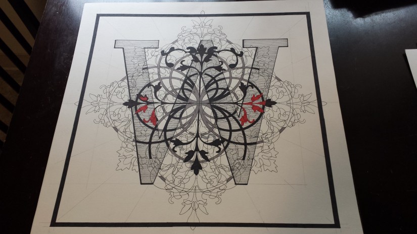
The SECOND Pismo 23 W was started at the end of August 2018 and there are a lot of elements of this design that I love – like the placement of the red and the design at the top of the picture in between the top of the W, for example – and I am planning on using them in future pictures, but I felt as if the overall design overwhelmed the W, making it difficult to distinguish the W from the rest of the design: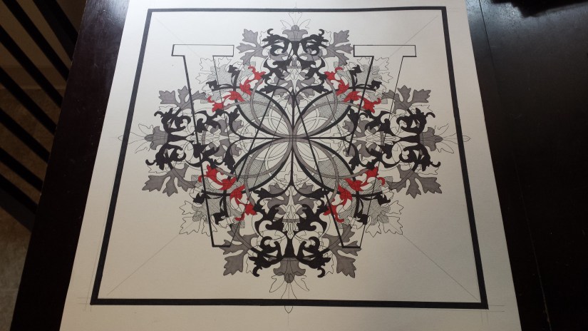
The THIRD Pismo 23 W was begun mid-December of 2018 and by this time I had abandoned the idea of “shading” in the W and decided to see how the design would look with the W not blocked in with color, just have the design continue through the letter. Unfortunately, I feel I over-designed this picture and it looked to “busy”, so I put it aside for a couple of weeks to see if there was any way that the picture could be “saved”… Ultimately, I decided it was time to move on: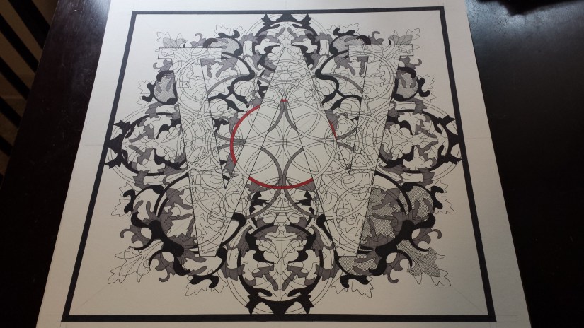
The FOURTH Pismo 23 W was started at the beginning of March 2019. I feel as if some of the more challenging deign problems have been resolved, but I have come to the point in this picture in which I feel it would be best to step away for a week or so to mull over next steps: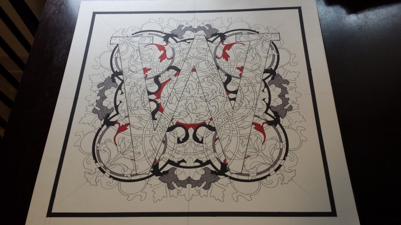
Why all this fuss about this particular letter? Well, for one thing, I had decided to start this series using letters that were important to me: family first names and last names. As my last name is White, it was only natural to start with this letter… and as this is a rather large-ish letter, I thought this would be a good letter to work out the parameters of the project and design issues in the hopes that once these have been smoothed out, the rest of the project would have a good chance of moving along more quickly.
And so far this have proven true: I currently have four Pismo pictures in various stages of completion: I am on my THIRD B, but I am working on my first A and R and so far, things are working out MUCH better and I do not feel as if I will need to re-start either of them.
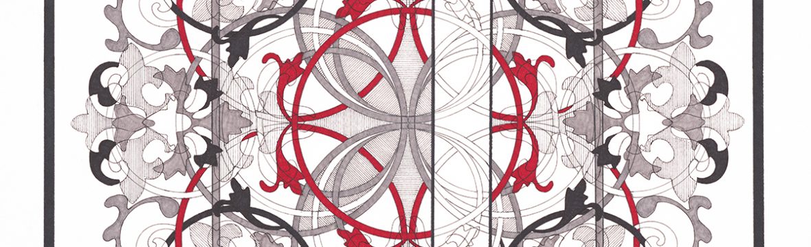
One of the ideas that I am toying with is that when this project has been completed that the letters could be combined into monograms resulting in a unique custom art print (please see rough idea/sample below):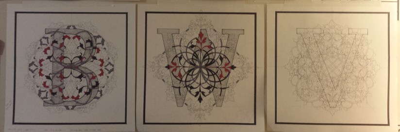
I would appreciate any feedback regarding:
- the project in general: do you think it is working / not working / suggestions for improvement
- letters to work on next
- how you feel about the monogram print idea
Looking forward to hearing from you!
White Rooster Studio
Copyright @2019 White Rooster Studios. All Rights Reserved.
