
I have been thinking quite a lot about the origin of the Pismo Series in relation to my love of Celtic illuminated letters… mostly remind myself of why I have taken on this project, but also to draw some inspiration from them as I progress even further into this series.
I have always loved illuminated letters and fonts, beginning with my early days in college art history and graphic design classes to the nine years I spent as an image-setter during the 1990’s – I am quite sure that that job title may be a tad obsolete now as the printing industry has changed tremendously since then and it is pretty much digital now.
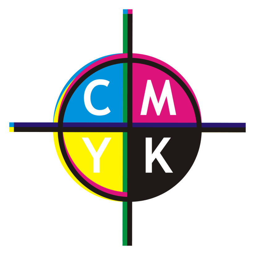
Essentially, my job was to take PageMaker and Quark design files and turn them into film so they can be sent to magazines and printers, mostly for ads but also for brochures, letterhead and presentation aides. I used to love making color keys that were used to confirm that the CMYK plates were going to print correctly. 
Each plate would print out one for each of the four colors and each layer would need to be added onto the previous one using registration marks to ensure that they all line up correctly in order to create the final color image.
I was also trained to develop and create slides as well as print posters and presentation transparencies… some of these mediums were considered cutting edge in the 1990’s, but, alas, are no longer in use today as technology has advanced so far ahead of all this and the industry has changed dramatically.
I firmly believe that my tenure as an image-setter further instilled my innate love of fonts – I used to have a thick book containing hundreds of fonts that I would thumb though for inspiration to use in my creative work. The idea of combining words and images has always fascinated me and I have struggled incorporating words into my work unsuccessfully for over 20 years. Combine this with a love of Celtic illuminated letters – like the ones below – and one day I found myself thinking about how to create MODERN illuminated letters… and if it could be done:


Which brings us to November of 2019 – I had begun the Pismo Series in August of 2018 and had set a goal of completing this project in two years. At the time, I had thought that completing 13 letters a year seemed to be a realistic goal, but I have since concluded that the shear number of design challenges – that change from letter to letter – have made this an unrealistic goal. To date, I have only completed six of the letters and am on my 5th and 6th versions of two of the letters.
At first I felt that I was obsessing about the overall designs and how the letters were coming out, but I now see that each letter has its own personality and that, for some of the letters, it is simply a learning curve and that I need to listen and observe how the design is evolving – there is no shame in re-doing a picture that you feel simply is not working. Each version teaches you something and there is ALWAYS some element that you can take away and use in another picture, so your time is NEVER wasted.
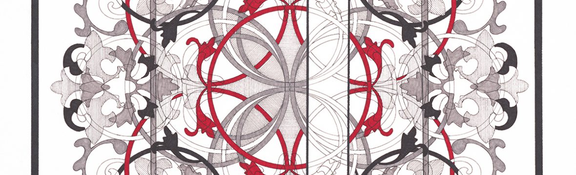
For example, I started Pismo 4 (D) last week and I really liked how the Knot and the biomorphic design came out, but when it came time to start filling in the shapes, I had the idea in my head to have the red circles rest on black ones:

As soon as I started filling in the black circles, I immediately regretted it and started to overthink it, feeling that i should have chose to fill in the circles with slate gray. I have since stepped away from the picture and am now seeing that perhaps it isn’t the “disaster” that I had originally thought it would be and have continued to start filling in some of the biomorphic shapes.
Some days, you just have to let it all go and allow the design to work itself out.
~~~~~~~~~~~~~~~~~~~~~~~~~~~~~~~~~~~~
If you enjoy the projects, pictures and posts, please see free to comment – feedback is encouraged and is always welcome.
Please check out White Rooster Studio:
- If you enjoy this blog, please enter your email address by going to the Menu, then the Home Page to have White Rooster Studio’s blog sent directly to you once it is published.
- You can also follow White Rooster Studio by using the direct links from the blog’s headers. For FB, please click on the FB button, and if you click on VIDA COLLECTION or ETSY SHOP you will be directed to those sites immediately.
- Any questions, comments? Please email whiteroosterstudio@gmail.com
White Rooster Studio
Copyright @2019 White Rooster Studios. All Rights Reserved.
