The eighth artist that will be highlighted is: ISABEL BISHOP:
According to her Wikipedia page: “Isabel was an American painter and graphic artist who depicted urban scenes of Union Square, New York, from the 1930s to the 1970s. She is best known for her depiction of American women and as a leading member of the Fourteenth Street School of artists.”
Unfortunately, there is not a lot of information available for Isabel, no biography (from what I can tell), no website, just a couple of articles and her catalogue raisonné.
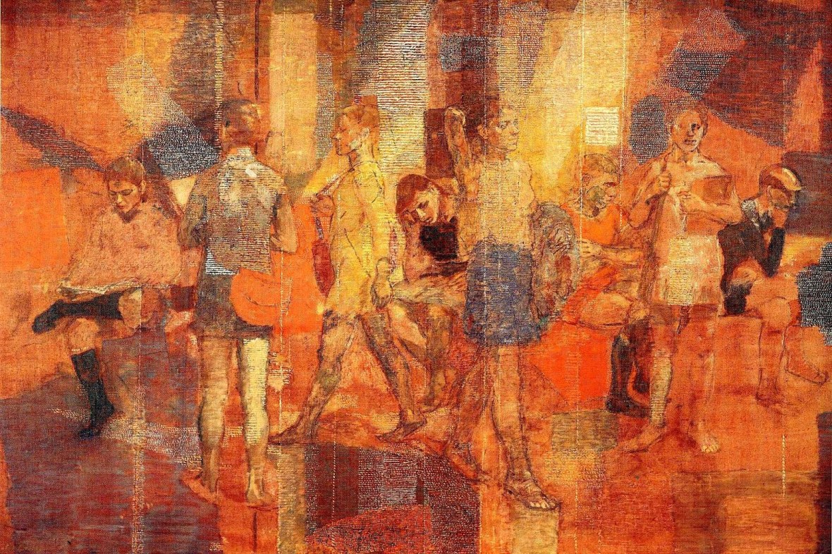
While looking into her online for this post, I came across some fascinating artwork of hers that deserves to be revisited:
Artists like Isabel are the reason that I create these Artist of the Month posts: so none of these artists are forgotten and, hopefully, they will be introduced to a new generation of admirers.
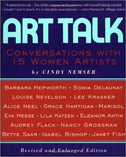
I did manage to locate online “Art Talk: Conversations with 15 women Artists” by Cindy Nemser and Isabel can be found on pages 303–320… now all I have to do is just to get my hands on a copy…
Please check out the White Rooster Studio Facebook page during the month of January for more photos of Isabel and images of her work.
~~~~~~~~~~~~~~~~~~~~~~~~~~~~~~~~~~~~
If you enjoy the projects, pictures and posts, please see free to comment – feedback is encouraged and is always welcome.
Please check out White Rooster Studio:
If you enjoy this blog, please enter your email address by going to the Menu, then the Home Page to have White Rooster Studio’s blog sent directly to you once it is published.
You can also follow White Rooster Studio by using the direct links from the blog’s headers. For FB, please click on the FB button, and if you click on VIDA COLLECTION or ETSY SHOP you will be directed to those sites immediately.
Any questions, comments? Please email whiteroosterstudio@gmail.com
White Rooster Studio
Copyright @2020 White Rooster Studios. All Rights Reserved.
White Rooster Studios is thrilled to announce that the Etsy shop will be adding new items at the beginning of 2020!
Printed Pacerback Tops – these tops are a lightweight material and feature original artwork from my I Ching Series, to start, the tops will be sold in XL:
Creative Action Front
Creative Action Back
Building Power Front
Building Power Back
2. Modal Scarves: These scarves are 100% Lenzing Modal – Modal is a luxuriously soft botanic silk fabric made of beechwood. Its botanic origin makes it eco-friendly and its fineness is comparable to that of natural silk. These scarves will also feature original artwork from my I Ching Series and come in one Size: 28″ × 78″ (Approximate):
Remaining Blameless Modal
Safety in Smallness Modal
Revolution Modal
Additional information – as well as pricing – will be added the first week of January, 2020!
~~~~~~~~~~~~~~~~~~~~~~~~~~~~~~~~~~~~
If you enjoy the projects, pictures and posts, please see free to comment – feedback is encouraged and is always welcome.
Please check out White Rooster Studio:
If you enjoy this blog, please enter your email address by going to the Menu, then the Home Page to have White Rooster Studio’s blog sent directly to you once it is published.
You can also follow White Rooster Studio by using the direct links from the blog’s headers. For FB, please click on the FB button, and if you click on VIDA COLLECTION or ETSY SHOP you will be directed to those sites immediately.
Any questions, comments? Please email whiteroosterstudio@gmail.com
White Rooster Studio
Copyright @2019 White Rooster Studios. All Rights Reserved.
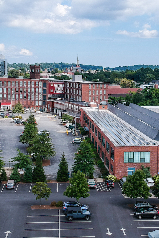
I will be entirely honest: I look forward to attending at least one Open Studio event at the Western Ave Studios in Lowell, MA every year… but due to some recent health issues, I really wasn’t in the mood or frame of mind to visit the studios on Saturday afternoon.
I toyed with some excuses as to NOT visit the studios… then I felt guilty about even thinking about not going… so I set a time-limit: about two hours or until I feel unwell, whichever came first.
The Western Ave Studios are a massive complex of five floors and three buildings of artist studios, so we took the elevator to the 5th floor, planning on making our way down and, hopefully, running into some friends along the way.
We step off the elevator and I am already thinking that this is going to be too much for me… and then I wander into the studio of an artist I had not met before. I was completely entranced by her work, absolutely loved the ideas behind a series she was working on and then we started talking and next thing I knew, I was sharing some postcards of my work with her and everything just changed inside of me: I was no longer thinking about how soon I could go home or how poorly I was feeling… I felt alive and excited about sharing with another artist about my work and listening to their ideas.
That one act of kindness from a fellow artist made all the difference for me that afternoon. And I encountered the same thing in several more studios that I wandered into: kindness, acceptance, sharing… and, healing.
I cannot stress enough the healing power of art on the mind and body.
A simple two-hour visit to a free open studio event benefited me more than I could ever have imagined. I had been feeling isolated as an artist lately and by going out and networking with other artists, I felt rejuvenated in regards to my work and excited about the connections I had made.
If you are in the Lowell, MA area, I highly recommend attending one of their monthly Open Studio events, you can check them out at: https://westernavenuestudios.com
WAS has more than 300 artists and there is absolutely something for everyone there. You can meet and talk to artists about their work, attend classes, lectures and sponsored events – one studio was advertising Handmade Book Classes and I immediately saw possibilities of utilizing this in my work, so looks like I will be checking that out soon!
~~~~~~~~~~~~~~~~~~~~~~~~~~~~~~~~~~~~
If you enjoy the projects, pictures and posts, please see free to comment – feedback is encouraged and is always welcome.
Please check out White Rooster Studio:
If you enjoy this blog, please enter your email address by going to the Menu, then the Home Page to have White Rooster Studio’s blog sent directly to you once it is published.
You can also follow White Rooster Studio by using the direct links from the blog’s headers. For FB, please click on the FB button, and if you click on VIDA COLLECTION or ETSY SHOP you will be directed to those sites immediately.
Any questions, comments? Please email whiteroosterstudio@gmail.com
White Rooster Studio
Copyright @2019 White Rooster Studios. All Rights Reserved.
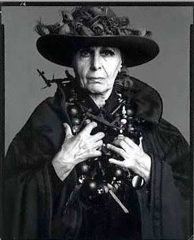
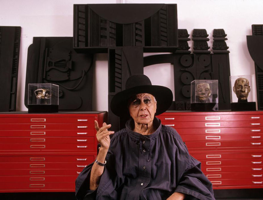
The seventh artist that will be highlighted is: LOUISE NEVELSON:
According to her Wikipedia page: “Louise Nevelson (September 23, 1899 – April 17, 1988) was an American sculptor known for her monumental, monochromatic, wooden wall pieces and outdoor sculptures.
Born in the Poltava Governorate of the Russian Empire (present-day Ukraine), she emigrated with her family to the United States in the early 20th century. Nevelson learned English at school, as she spoke Yiddish at home.
By the early 1930s she was attending art classes at the Art Students League of New York, and in 1941 she had her first solo exhibition. A student of Hans Hofmann and Chaim Gross, Nevelson experimented with early conceptual art using found objects, and dabbled in painting and printing before dedicating her lifework to sculpture. Usually created out of wood, her sculptures appear puzzle-like, with multiple intricately cut pieces placed into wall sculptures or independently standing pieces, often 3-D. One unique feature of her work is that her figures are often painted in monochromatic black or white. A figure in the international art scene, Nevelson was showcased at the 31st Venice Biennale. Her work is seen in major collections in museums and corporations. Nevelson remains one of the most important figures in 20th-century American sculpture.”
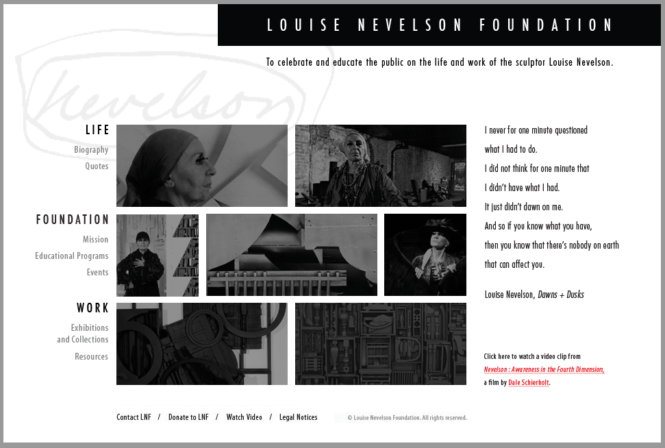
To learn more about Louise, please check out one of her biographies: “Louise Nevelson: Art is Life” (2016) by Laurie Wilson and “Louise Nevelson: A Passionate Life” (1990) by Laurie Lisle.
Please check out some of Louise’s sculptures below:
Please check out the White Rooster Studio Facebook page during the month of December for more photos of Louise and images of her work.
~~~~~~~~~~~~~~~~~~~~~~~~~~~~~~~~~~~~
If you enjoy the projects, pictures and posts, please see free to comment – feedback is encouraged and is always welcome.
Please check out White Rooster Studio:
If you enjoy this blog, please enter your email address by going to the Menu, then the Home Page to have White Rooster Studio’s blog sent directly to you once it is published.
You can also follow White Rooster Studio by using the direct links from the blog’s headers. For FB, please click on the FB button, and if you click on VIDA COLLECTION or ETSY SHOP you will be directed to those sites immediately.
Any questions, comments? Please email whiteroosterstudio@gmail.com
White Rooster Studio
Copyright @2019 White Rooster Studios. All Rights Reserved.
I have been thinking quite a lot about the origin of the Pismo Series in relation to my love of Celtic illuminated letters… mostly remind myself of why I have taken on this project, but also to draw some inspiration from them as I progress even further into this series.
I have always loved illuminated letters and fonts, beginning with my early days in college art history and graphic design classes to the nine years I spent as an image-setter during the 1990’s – I am quite sure that that job title may be a tad obsolete now as the printing industry has changed tremendously since then and it is pretty much digital now.
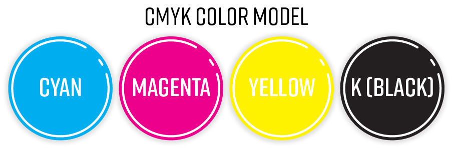
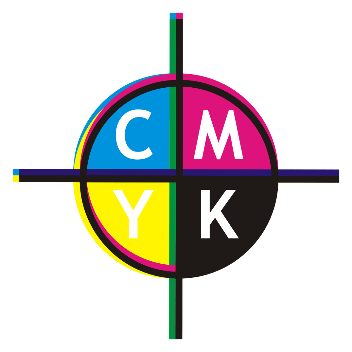
Essentially, my job was to take PageMaker and Quark design files and turn them into film so they can be sent to magazines and printers, mostly for ads but also for brochures, letterhead and presentation aides. I used to love making color keys that were used to confirm that the CMYK plates were going to print correctly.
Each plate would print out one for each of the four colors and each layer would need to be added onto the previous one using registration marks to ensure that they all line up correctly in order to create the final color image.
Example of a mismatched image when the registration marks do not line up correctly.
I was also trained to develop and create slides as well as print posters and presentation transparencies… some of these mediums were considered cutting edge in the 1990’s, but, alas, are no longer in use today as technology has advanced so far ahead of all this and the industry has changed dramatically.
I firmly believe that my tenure as an image-setter further instilled my innate love of fonts – I used to have a thick book containing hundreds of fonts that I would thumb though for inspiration to use in my creative work. The idea of combining words and images has always fascinated me and I have struggled incorporating words into my work unsuccessfully for over 20 years. Combine this with a love of Celtic illuminated letters – like the ones below – and one day I found myself thinking about how to create MODERN illuminated letters… and if it could be done:
Which brings us to November of 2019 – I had begun the Pismo Series in August of 2018 and had set a goal of completing this project in two years. At the time, I had thought that completing 13 letters a year seemed to be a realistic goal, but I have since concluded that the shear number of design challenges – that change from letter to letter – have made this an unrealistic goal. To date, I have only completed six of the letters and am on my 5th and 6th versions of two of the letters.
At first I felt that I was obsessing about the overall designs and how the letters were coming out, but I now see that each letter has its own personality and that, for some of the letters, it is simply a learning curve and that I need to listen and observe how the design is evolving – there is no shame in re-doing a picture that you feel simply is not working. Each version teaches you something and there is ALWAYS some element that you can take away and use in another picture, so your time is NEVER wasted.
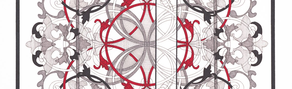
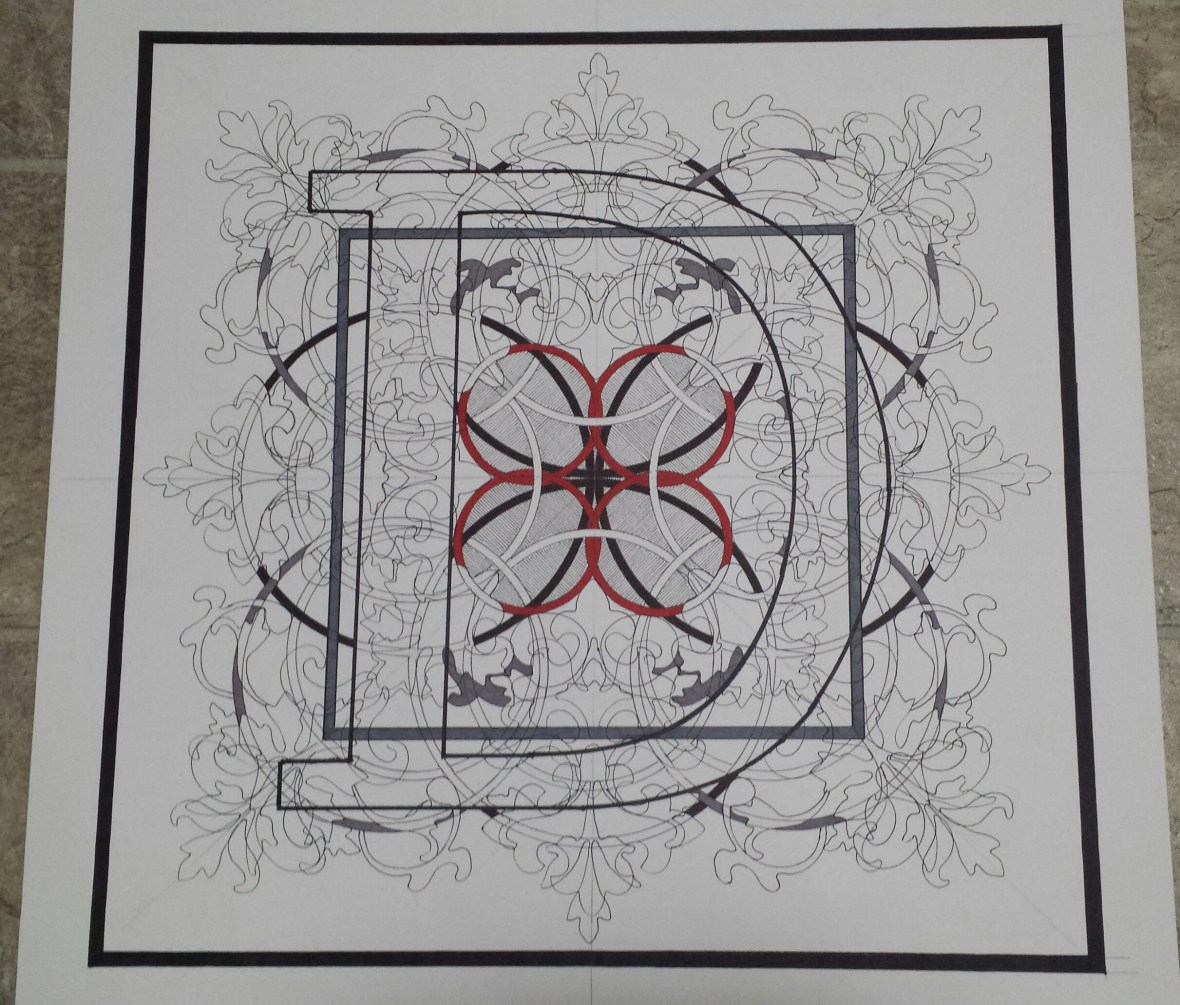
For example, I started Pismo 4 (D) last week and I really liked how the Knot and the biomorphic design came out, but when it came time to start filling in the shapes, I had the idea in my head to have the red circles rest on black ones:
As soon as I started filling in the black circles, I immediately regretted it and started to overthink it, feeling that i should have chose to fill in the circles with slate gray. I have since stepped away from the picture and am now seeing that perhaps it isn’t the “disaster” that I had originally thought it would be and have continued to start filling in some of the biomorphic shapes.
Some days, you just have to let it all go and allow the design to work itself out.
~~~~~~~~~~~~~~~~~~~~~~~~~~~~~~~~~~~~
If you enjoy the projects, pictures and posts, please see free to comment – feedback is encouraged and is always welcome.
Please check out White Rooster Studio:
If you enjoy this blog, please enter your email address by going to the Menu, then the Home Page to have White Rooster Studio’s blog sent directly to you once it is published.
You can also follow White Rooster Studio by using the direct links from the blog’s headers. For FB, please click on the FB button, and if you click on VIDA COLLECTION or ETSY SHOP you will be directed to those sites immediately.
Any questions, comments? Please email whiteroosterstudio@gmail.com
White Rooster Studio
Copyright @2019 White Rooster Studios. All Rights Reserved.