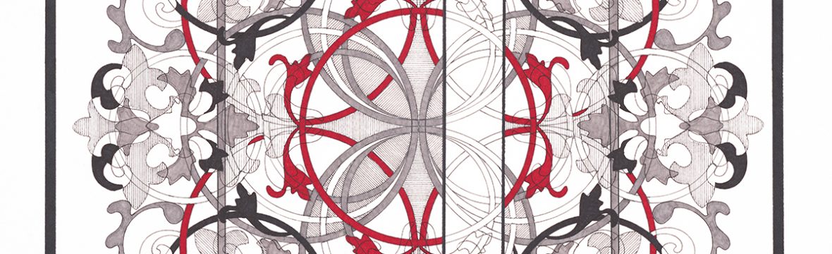

A couple of days ago I woke up with an image in my head, what I thought could be the start of (yes, yet another) new series. I saw a capital letter added to my knots and organic shapes and with some tweaking, I believe I have come up with something fun:
- Scope of project: 26 pictures
- Size of picture: 20 x 20 inches
- Font: Lucida Sans
- Size of letter: 12 inches
- Rule: Whatever is “inside” of the letter, the opposite is to be done on the “outside”
Template: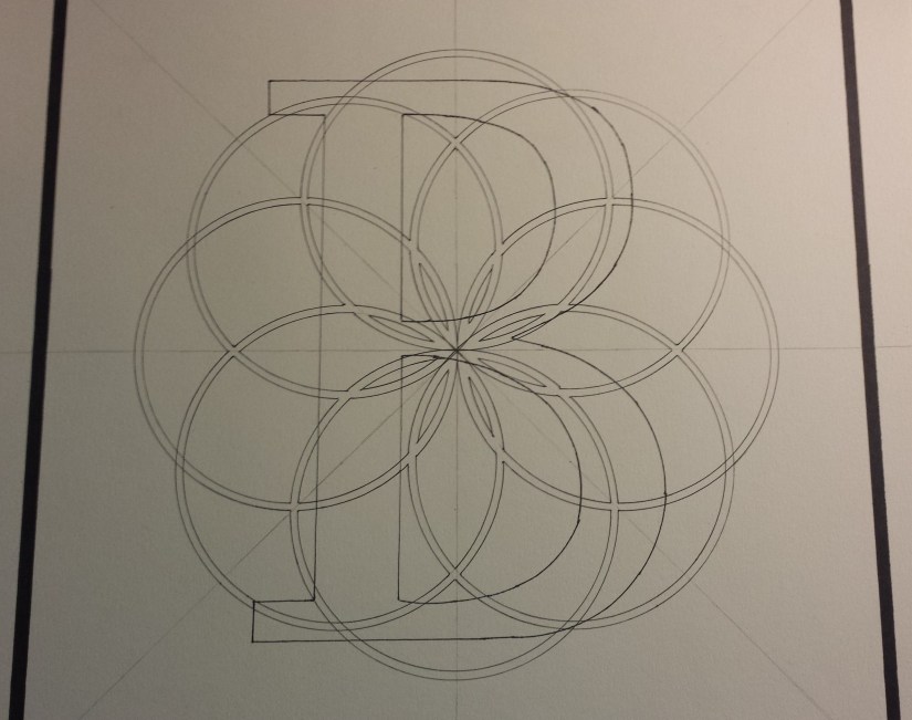
Beginning of experiment: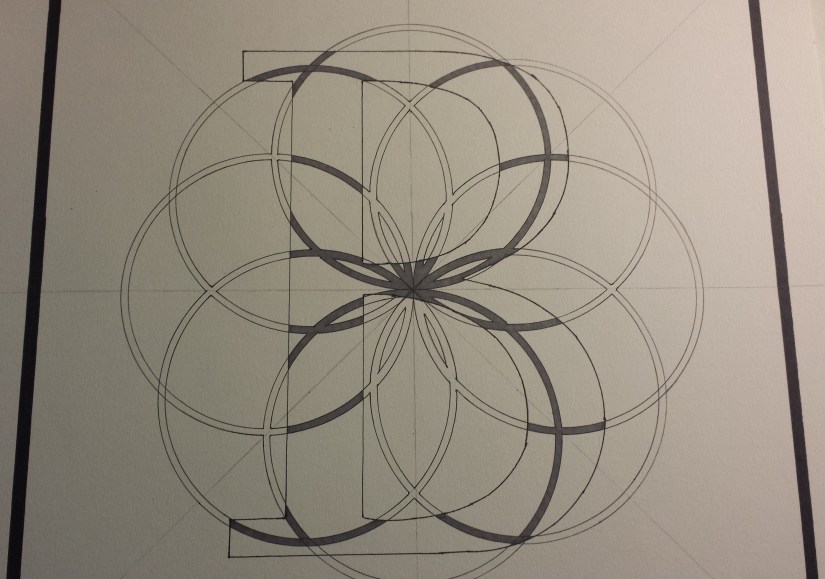
Organic design completed: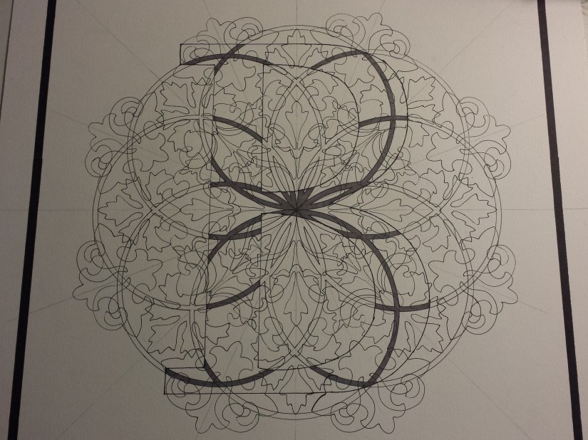
Initial stage completed, letter “B” has been shaded and the main portion of the blocking in of shapes where they come in contact with the “B” has been filled in: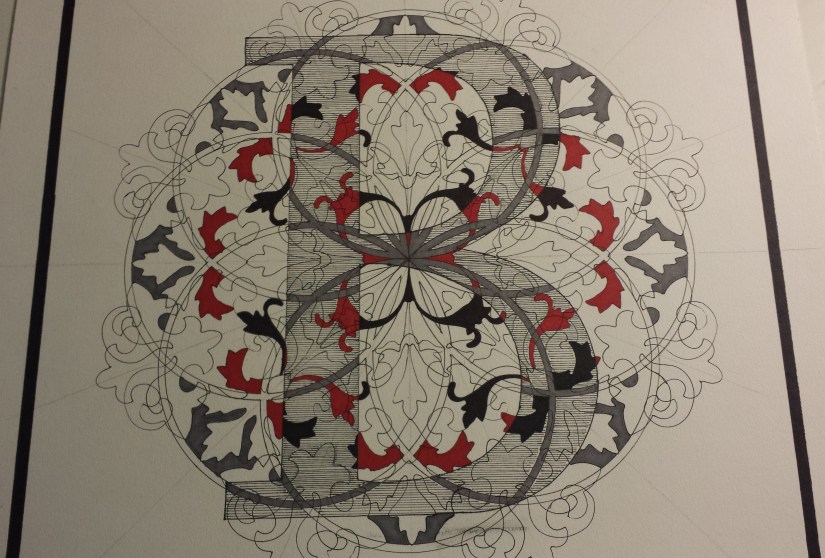
Close up of the “B”, the ink smudge on the bottom portion of the picture was the result of ink build-up on my rolling ruler. Seeing that the final step will be adding the ink layers, I am hopeful that the smudge will not be as noticeable once the picture has been completed (cross fingers):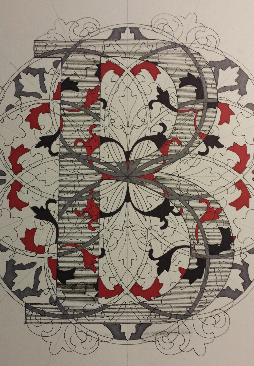
I decided to call this series Pismo because the Letter Project or the Monogram Series just sounded boring and my partner came up with the brilliant suggestion to check out what the word “letter” was in other languages (THANK YOU!!!). Most of the suggestions were just as boring as “letter” or “monogram”, but Pismo came up a couple of times, so I chose the Croatian word for “letter”.
I should also mention that this amused me seeing we had just watched the FIFA World Cup match between Croatia and Russia in which Croatia won after extra time and penalty kicks. So, go Croatia! Good luck on Wednesday!
White Rooster Studio
Copyright @2018 White Rooster Studios. All Rights Reserved.
