I believe that I have gone about as far as I can go with “Pismo 23 (W)” without overworking the picture:
This issue now is: the W is kind of hard to see now. I love the design, but I need to figure out what to do about making the W more prominent. I have thought of added a light wash of Chinese white watercolor paint over the letter as well as adding some kind of shadow under the letter… just not sure if that would ruin the picture yet.
I have “Pismo 22 (V)” that needs to be re-worked, so I am going to test this idea on that picture before I move forward with the W.
I have considered going back to my original idea that whatever is within the letter should be the opposite without… I found a Celestial Grey Sharpie online and ordered a couple to see if that would work… 
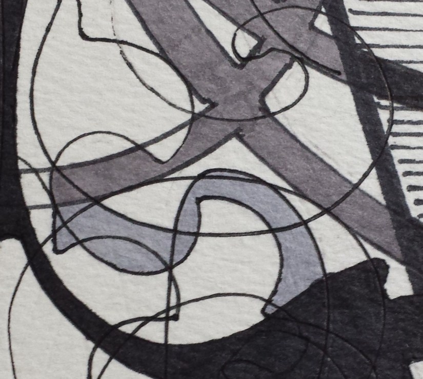
The Slate Grey Sharpie that I have been using is on the top and the new Celestial Grey Sharpie is on the bottom. Based on the colored caps, one would think that this COULD work… Alas, I don’t think it will:
The Slate Grey DOES appear darker, but I don’t think that the Celestial Grey that I added as a test near the knot is light enough to use to resurrect my original idea. The Celestial grey is cooler, but I feel it still would be difficult to distinguish between the two greys when viewing the picture at a distance.
This all may be a blessing in disguise as I am pretty much convinced that I have purchased ALL of the remaining Celestial Grey Sharpies available on the Internet right now. My concern was: should this experiment work, would I be able to buy enough Celestial Grey Sharpies to complete this project??
So… will be doing tests this week with the Chinese white watercolor wash and will cross my fingers that I will have more success with making the letter stand out more.
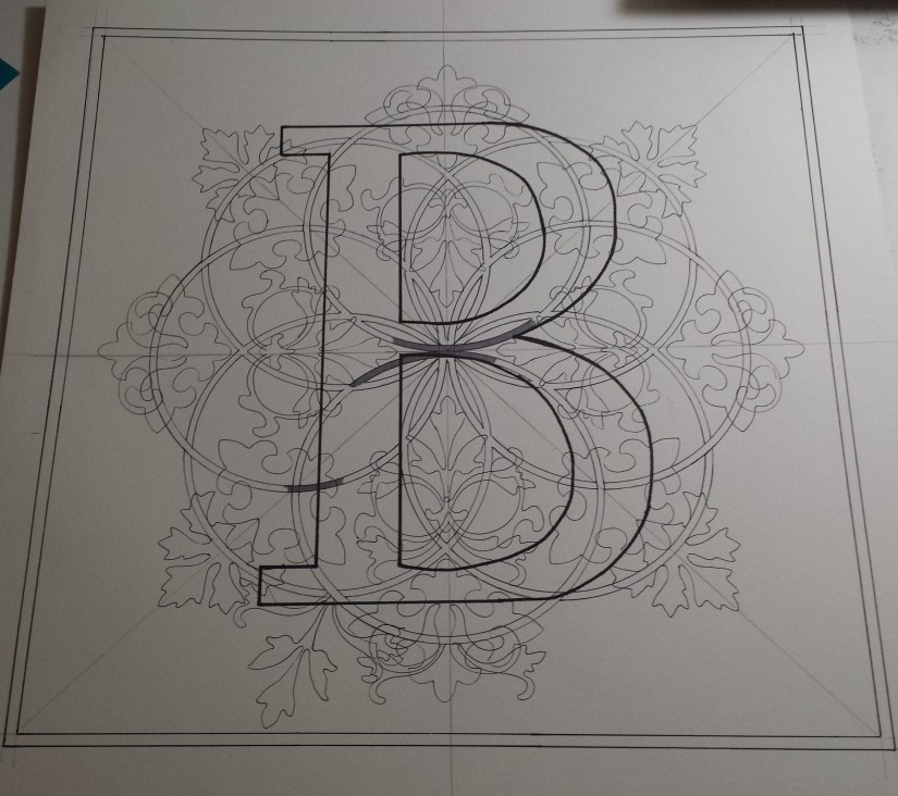
I have begun a 2nd version of “Pismo 2 (B)”… and I am not sure I like the direction that it is going in yet:
Obviously, the overall design has not been completed, so perhaps it is too soon to worry about the finished product. I think I am just going to stop worrying about the project in general and just let go and let the design evolve naturally and see where it takes me.
White Rooster Studio
Copyright @2018 White Rooster Studios. All Rights Reserved.


