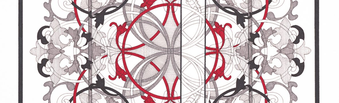

The past couple of weeks have been incredibly productive and I am officially calling the following pictures completed:


I am on the fence about calling Pismo 5 E completed, so I am looking for comments and/or suggestions regarding how it looks – I am concerned that the picture has been overworked, I have been assured that it hasn’t been… but there is a part of me that is leaning towards a re-do:
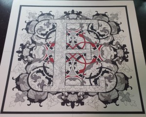
I am wondering if my indecision regarding this picture has something to do with how I am now approaching the pictures in the series: less is more. At first, I was overdoing it with the biomorphic forms, almost trying to force new shapes to “appear”… over the past couple of months, and especially with Pismo 23 V and Pismo 12 L, the process has evolved and less of the forms are used to make new shapes and designs.
I am also finding that I am able to design and complete a picture much quicker now that I have worked out more of the quirks regarding this project. I am “relaxing” my “rule” about not filling in the letter… I will admit that this was prompted by small “mistakes” on my part, but the overall effect of these small errors have added some charm to the pictures and going forward, I will be deliberately adding “mistakes” to the design to enhance certain shapes.
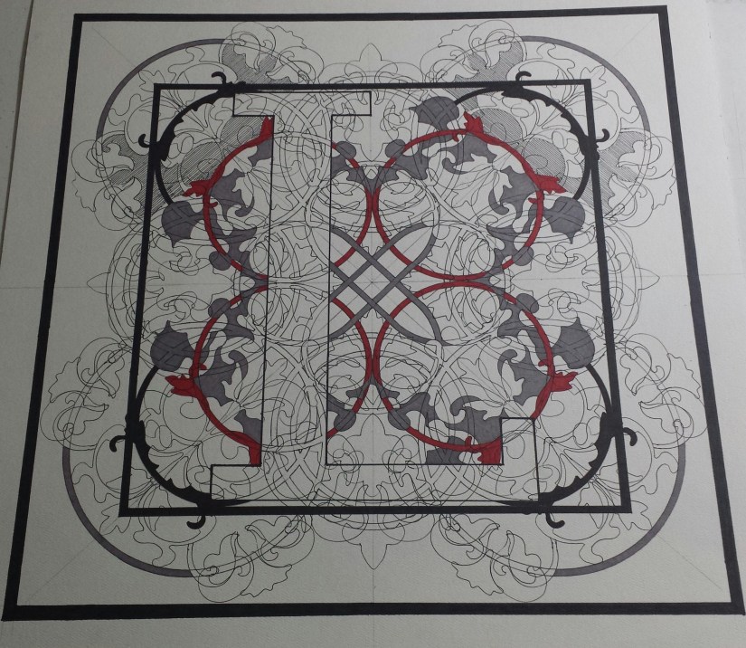
I started Pismo 12 L last weekend and have completed more than 60% of the picture since then. I think that the corners need to be built up just a little bit and there is, of course, a small design issue with a small part of the design that I would like to think about for a couple of days – so up on the Wall it goes!
I have made the hard decision to re-do – once again – Pismo 2 B and Pismo 23 W. I feel that these two letters have taken the brunt of my discovery process for this series and, as a result, they have been re-done multiple times. But, there is good news for my two guinea pigs: I feel that the series is on the right track and I feel that I can confidently design new versions of these two letters now:


When I came up with the idea for the Pismo Series, I envisioned designing my own set of ornamental letters which would then be combined into personalized monograms for prints to sell in my Etsy shop. Once the series has been completed and scanned, I would then be able to combine the letters in Photoshop and then have the new monogram printed professionally.
Quite honestly, the possibilities are seemingly endless. These individual prints can be combined and printed as professional prints, on notecards, coffee mugs, utilized in my VIDA collection (as individual letters only for scarves and handbags)…
You can almost SEE where this can go – for example, check out how the pictures are hung on the studio wall:

I have done a bit of reading about monogram etiquette and feel that I now have a good idea of how this could be done in Photoshop, now, all there is left to do is continue to plug away at the series.
The goal is to have half of the project completed by the beginning of November so new items can be added to the Etsy shop in time for the holiday season and, if all goes well, the entire project could be completed this time next year!
~~~~~~~~~~~~~~~~~~~~~~~~~~~~~~~~~~~~
If you enjoy the projects, pictures and posts, please see free to comment – feedback is encouraged and is always welcome.
Please check out White Rooster Studio:
- If you enjoy this blog, please enter your email address by going to the Menu, then the Home Page to have White Rooster Studio’s blog sent directly to you once it is published.
- You can also follow White Rooster Studio by using the direct links from the blog’s headers. For FB, please click on the FB button, and if you click on VIDA COLLECTION or ETSY SHOP you will be directed to those sites immediately.
- Any questions, comments? Please email whiteroosterstudio@gmail.com
White Rooster Studio
Copyright @2019 White Rooster Studios. All Rights Reserved.
