I have new tools arriving – hopefully this week – that I am hoping will help me complete these pictures, so excited to experiment and share new pics soon!
~~~~~~~~~~~~~~~~~~~~~~~~~~~~~~~~~~~~
If you enjoy the projects, pictures and posts, please see free to comment – feedback is encouraged and is always welcome.
Please check out White Rooster Studio:
If you enjoy this blog, please enter your email address by going to the Menu, then the Home Page to have White Rooster Studio’s blog sent directly to you once it is published.
You can also follow White Rooster Studio by using the direct links from the blog’s headers. For FB, please click on the FB button.
Any questions, comments? Please email whiteroosterstudio@gmail.com
White Rooster Studio
Copyright @2026 White Rooster Studios. All Rights Reserved.
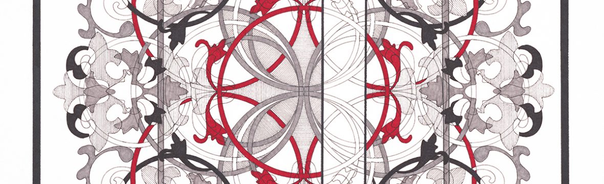
The Virtues Project is officially underway – as of July 4th, 2021, five pictures are currently in progress!
There is still a lot to complete and to determine how to finish these pictures, but significant progress has been made in a very short time. Please see timeline and work in progress pictures below:
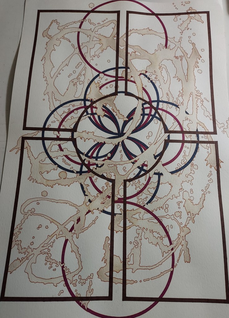
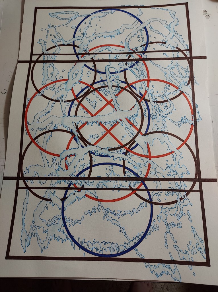
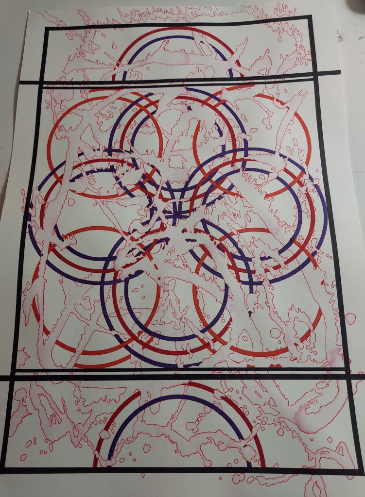
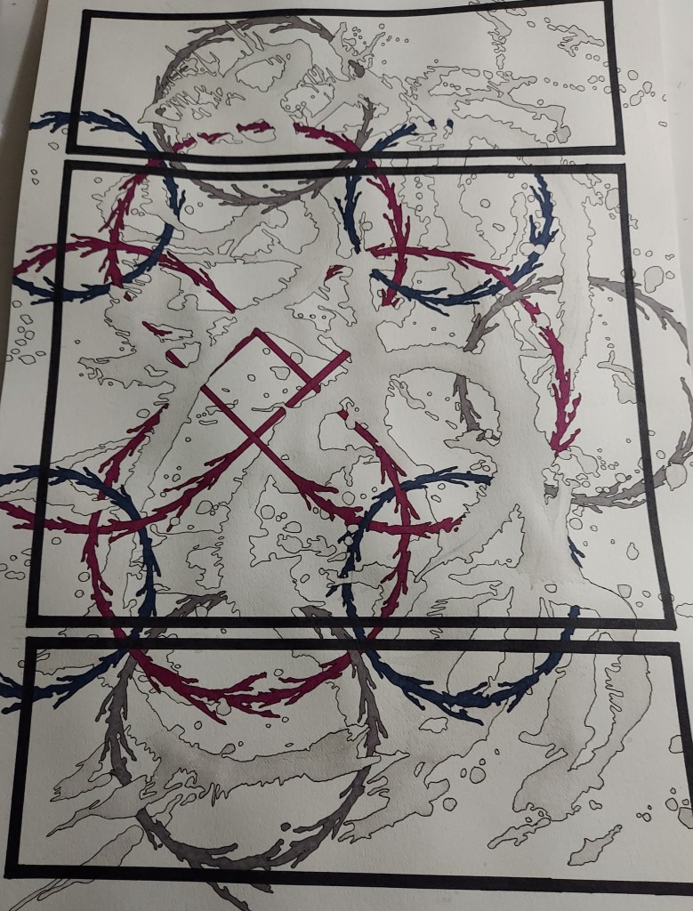
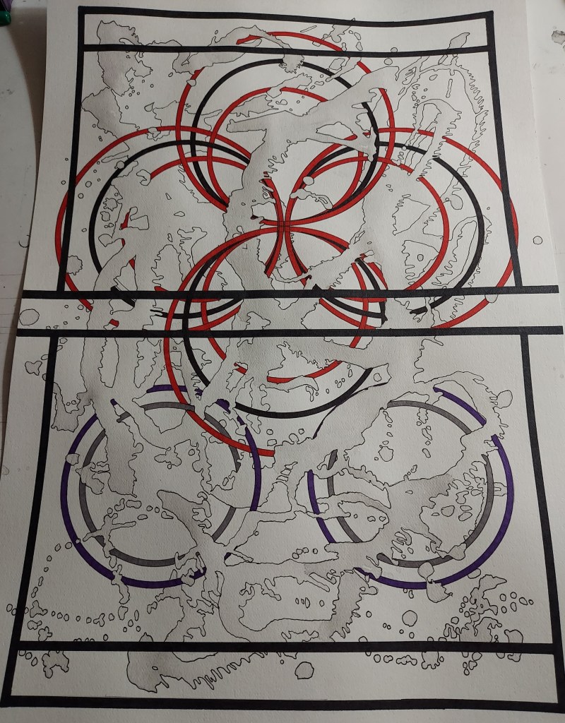
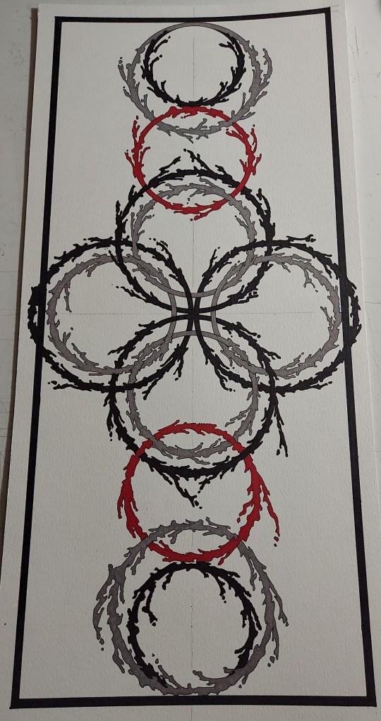
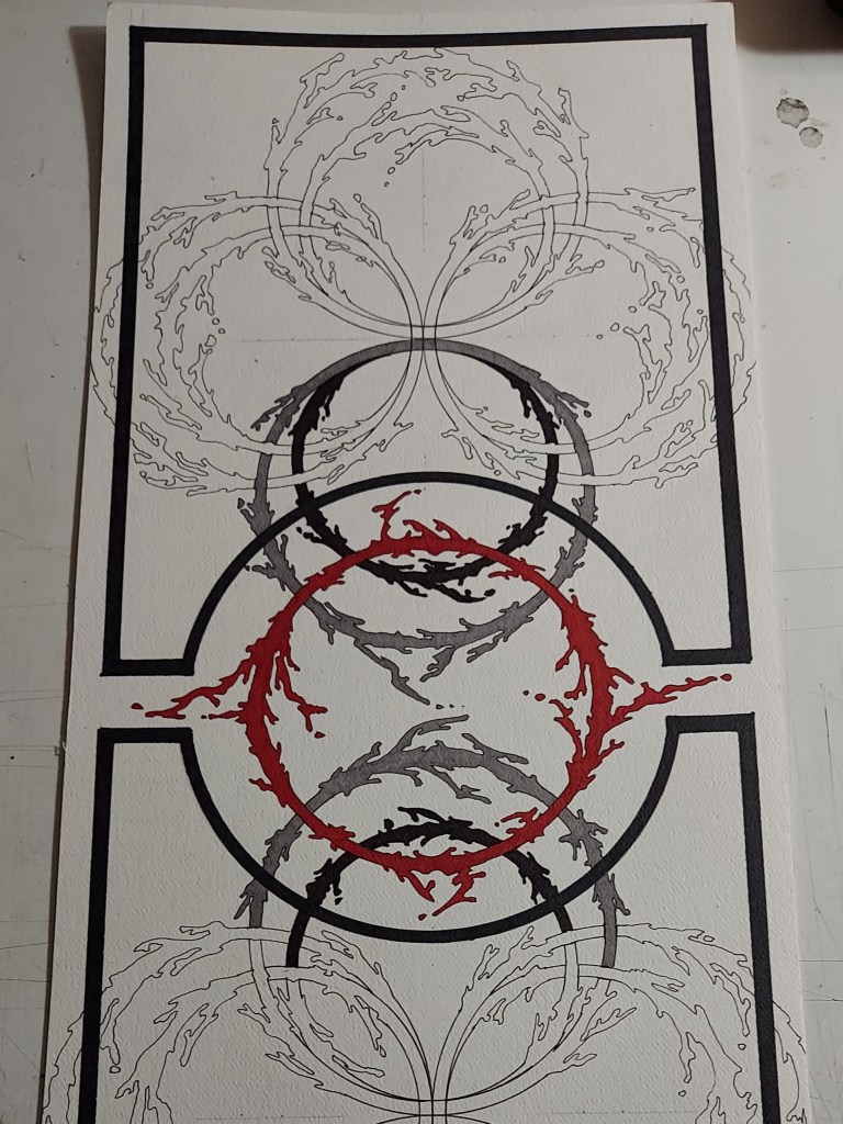
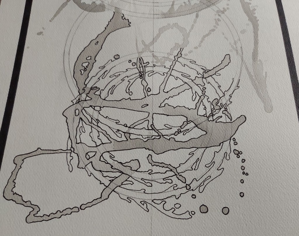
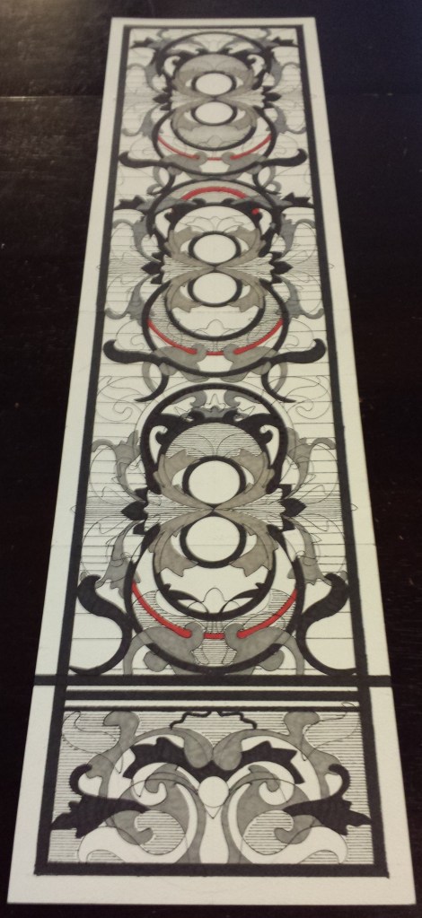
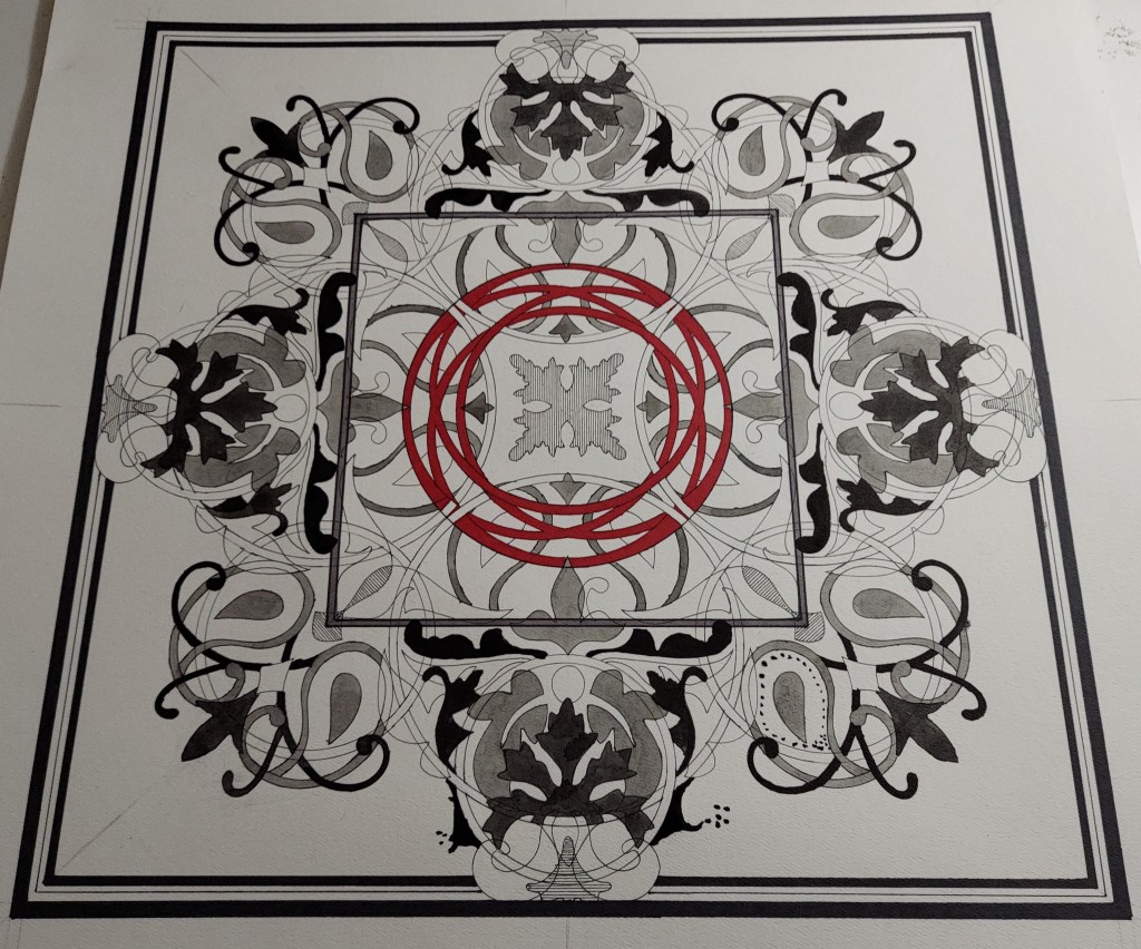
Acceptance continues my experiment with a more “organic” Knot look as well as testing out sepia ink washes. Primary colors are sepia, brown and berry:
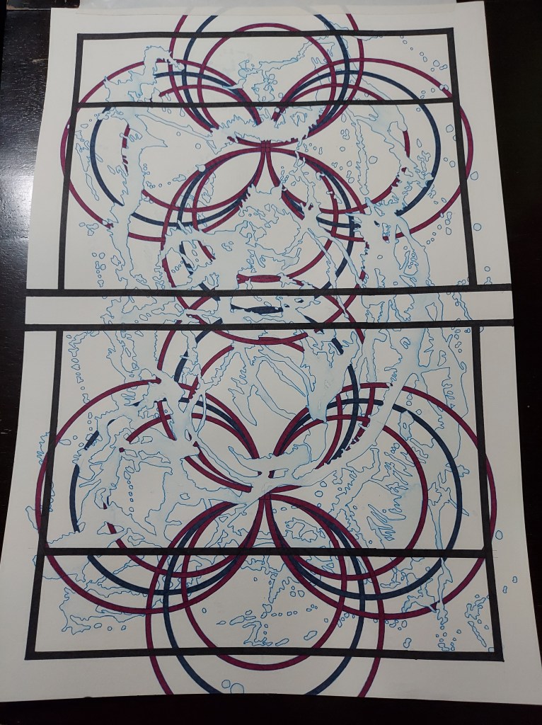
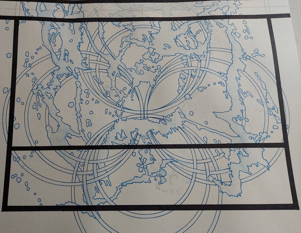
I have decided to experiment with color inks for this project and in addition to my usual black ink washes, I have added sepia, blue and (upcoming) red inks washes and additional complementary colors. I have been taking full advantage of this long holiday weekend and will be uploading more work in progress pics soon!
~~~~~~~~~~~~~~~~~~~~~~~~~~~~~~~~~~~~
If you enjoy the projects, pictures and posts, please see free to comment – feedback is encouraged and is always welcome.
Please check out White Rooster Studio:
If you enjoy this blog, please enter your email address by going to the Menu, then the Home Page to have White Rooster Studio’s blog sent directly to you once it is published.
You can also follow White Rooster Studio by using the direct links from the blog’s headers. For FB, please click on the FB button, and if you click on VIDA COLLECTION, LE GALERISTE or ETSY SHOP you will be directed to those sites immediately.
Any questions, comments? Please email whiteroosterstudio@gmail.com
White Rooster Studio
Copyright @2021 White Rooster Studios. All Rights Reserved.
It’s been a great couple of weeks – I think I have finally hit on an idea that I am extremely excited about and feel confident that this will add an interesting element to the Virtues Project.
I stumbled across an idea that I had abandoned after graduating from college while flipping though a sketchbook from that time and thought that this could be adapted into something that could incorporate the ideas that I had been working with for the past couple of years and push them into a fun, new direction:
So I tried a couple of different approaches, using some paper scraps from the Pismo Series that are approximately 9.5×22 inches:
Ultimately, I couldn’t resist trying this idea out on a 22×22 inch piece of paper – I like the idea… just wasn’t sure what to do with it:
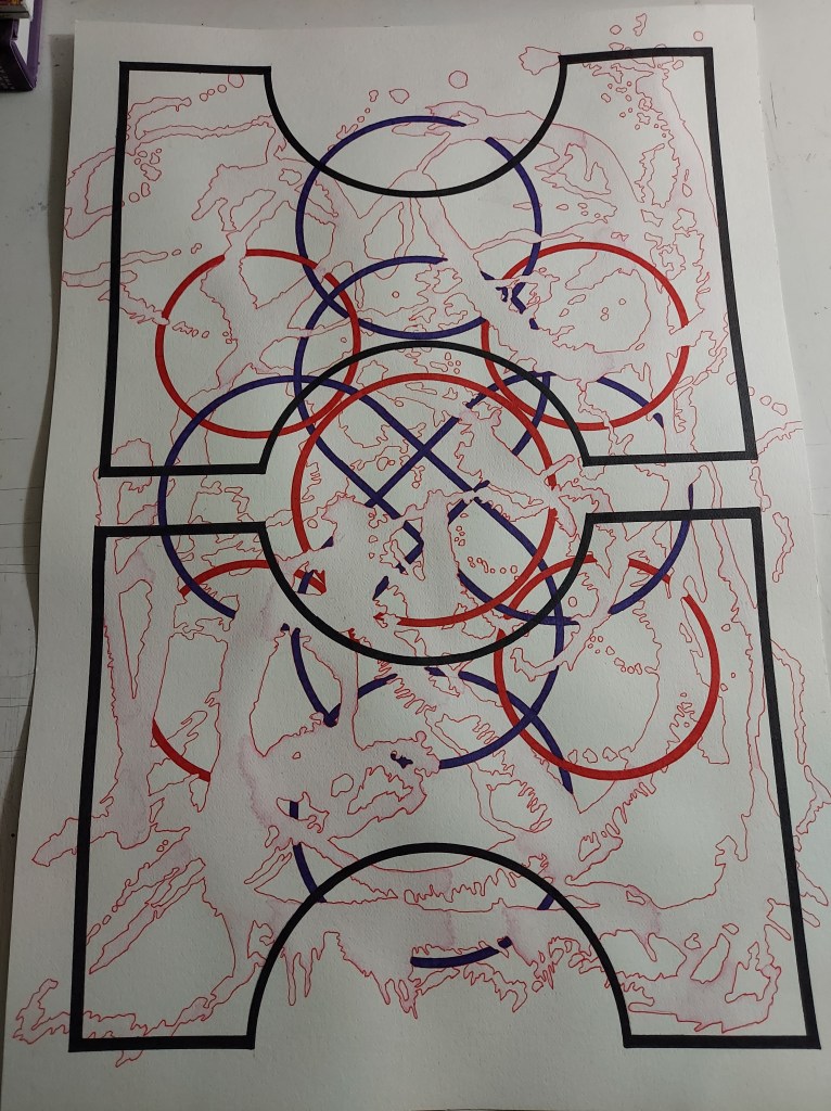
I thought maybe adding a ink layer would help out a bit and found a irrigation tool that would be perfect and tested it on a couple of 9.5×22 sheets of paper:
I thought outlining the ink would make it more exciting and add some dimension:
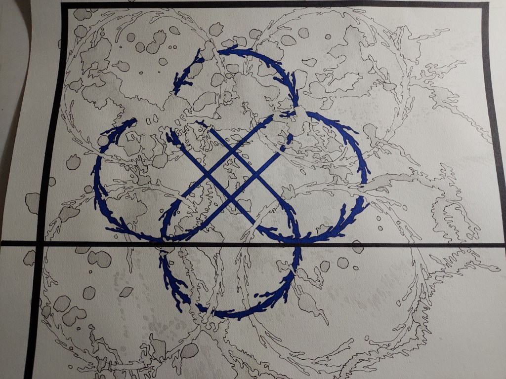
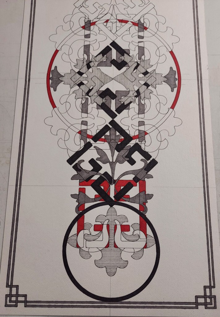
I am extremely excited about the direction that this piece is going in, I know it need something more… so I’ve added it to the studio wall and am patiently waiting for some inspiration on how to finish this. I do have to say that I have been continuing to experiment with the Aquash Water Brushes and think that this may be a possible solution in regards to next steps. Also, I received some feedback on the White Rooster Studio Facebook page when I posted this work in progress pic and added some blue to the picture (thank you!!)… for a long time I shied away from adding color as I had quite a lot of failures a couple of years ago… but I like how this is coming out and am encouraged to give color another try 🙂
I suppose it is no surprise that I couldn’t resist trying this idea out on a 20×20 sheet of paper… I should mention that the “smiley” face in the bottom center circle was completely unintentional:
On this one, I tried to let the ink dictate the shapes and even incorporated some of the ink blotches into the circles:
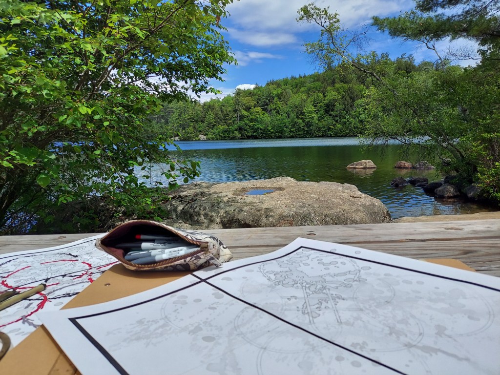
I had the opportunity to work on this one outside for the first time this season… Honestly, can’t think of a better “studio” to be working in:
A couple of days ago, I was thinking on how I can “spice” this idea up even more and I thought of using sepia ink and even found some great drawing pens with brown ink. This could allow the project to evolve even more and allow for more colors to be added, so I am extremely impatient to try this idea out… just have to wait for the delivery!
~~~~~~~~~~~~~~~~~~~~~~~~~~~~~~~~~~~~
If you enjoy the projects, pictures and posts, please see free to comment – feedback is encouraged and is always welcome.
Please check out White Rooster Studio:
If you enjoy this blog, please enter your email address by going to the Menu, then the Home Page to have White Rooster Studio’s blog sent directly to you once it is published.
You can also follow White Rooster Studio by using the direct links from the blog’s headers. For Facebook, please click on the FB button.
Any questions, comments? Please email whiteroosterstudio@gmail.com
White Rooster Studio
Copyright @2026 White Rooster Studios. All Rights Reserved.
I have been having some difficulty with my new project: lots of stops, starts, changing direction… changing size, do I use the water brushes or not? How about ink layers? UGH…
I haven’t really liked many of my experiments these past couple of weeks, which has resulted in too much time spent overthinking, over planning and not enough time playing.
Inevitably, I ended up overworking a picture two weeks ago, but managed to save the part that I thought was working for future ideas:
I tried out some new shapes and used a combination of the water brushes and the Sharpies and I believe that this has something interesting going for it, so I tried a different approach last week and am really enjoying the results:
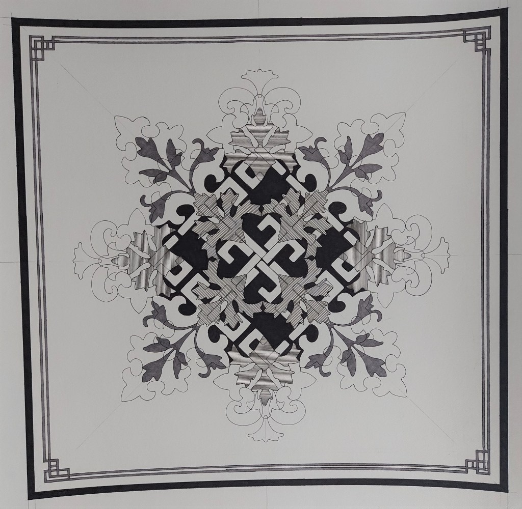
I did stop at this point and added this to the studio wall for the time being. There is a idea that is slowly developing on how to finish this picture, but in the meantime, I wanted to move onto some other new ideas until the solution was more concrete in my head. Kind of looks like a snowflake right now, so maybe just adding some ink layers behind it would make it “pop” and give it a more finished look.
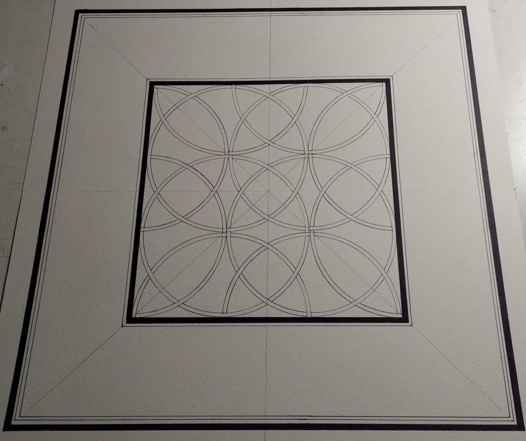
In 2017 I completed a picture called Totem (see below) that consisted of four 4×4 squares that I thought had some series potential, but really hadn’t managed to get around to exploring it and shelved the idea. That is, until yesterday.
@2017, Jenn White, Totem #1
I had been trying to use up some leftover paper and wanted to challenge myself when I started playing with a 9.5×22 piece of scrap paper and ended up thinking about Totem:
@2021, Jenn White, Totem test
The idea is to “layer” the shapes, trying to give them a new look and maybe a new dimension. So far, I like way this is developing. Now back to playing 🙂
~~~~~~~~~~~~~~~~~~~~~~~~~~~~~~~~~~~~
White Rooster Studio
Copyright @2026 White Rooster Studios. All Rights Reserved.
I have mostly been focusing on trying new art tools, techniques and shapes for the Virtues Project for the past couple of weeks. No complete pictures yet, but some new designs and new looks:
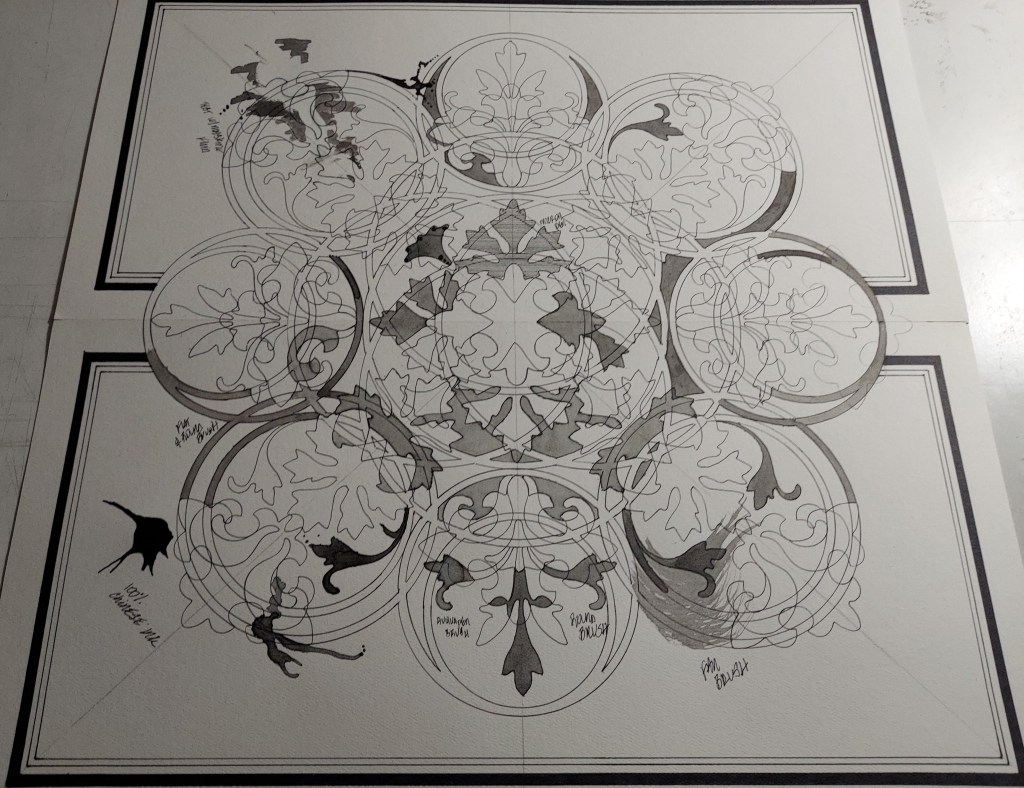
I spent a couple of days working out the design for this picture and I love the way it came out… honestly, just not sure what to do with it yet, so I have added it to my studio wall confident that inspiration will strike soon:
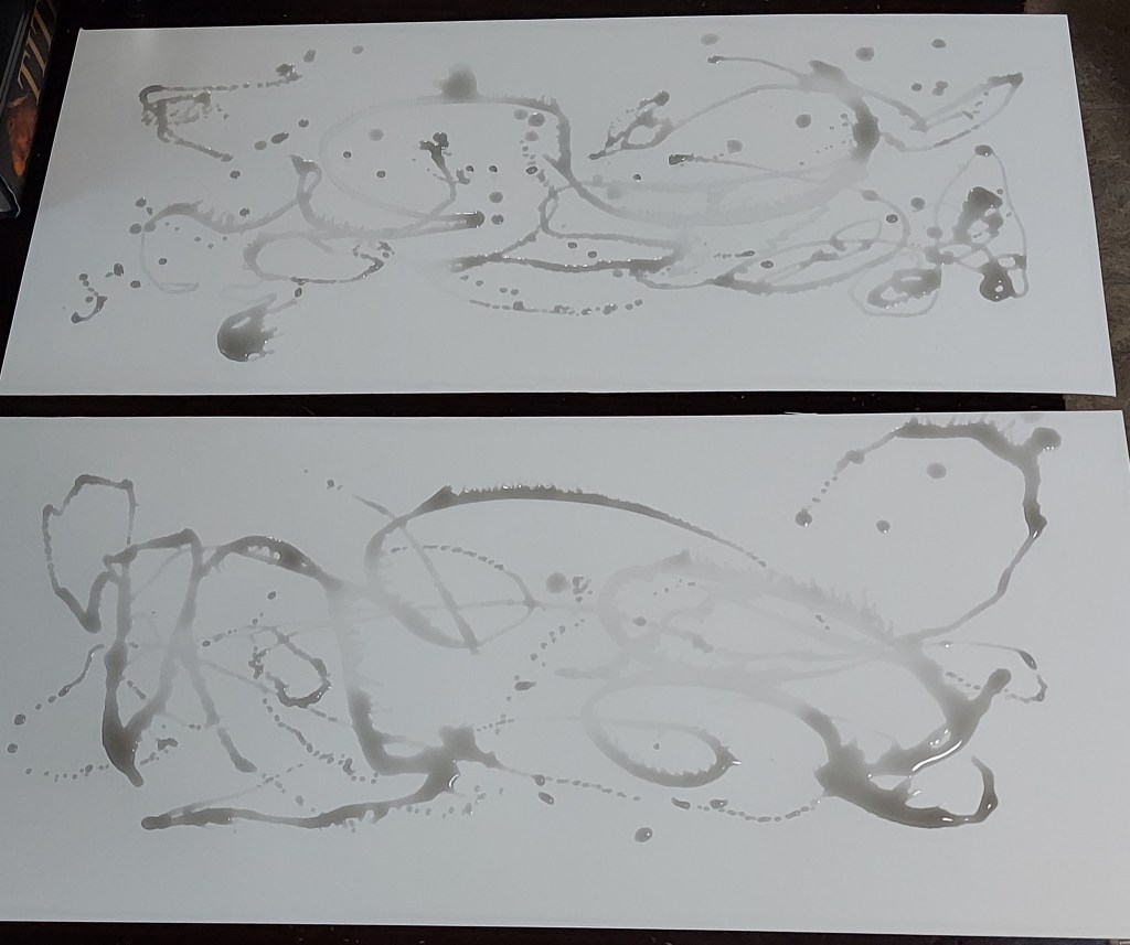
I also tested out some inking techniques so I can work out the look of the project. I used several different ink washes using standard watercolor brushes – for the most part, I like results, just feel that I need more practice with the brushes as it has been far too long since I worked with them. Still, I do like the unpredictability of some of the tests :
I also spent a lot of time working with Aquash Water Brushes and find that I am torn between the Aquash brushes and the standard watercolor brushes. The are benefits and detractions for both and I am leaning towards a using a combination of both going forward with this project:
The picture above was inked using mostly the Aquash Water Brushes and I tried to keep the design simple while experimenting with the brushes. I feel that I am gaining some sense of control over the how the ink looks when applied, but even with labeling the brushes with light, medium or 100% ink in the barrels, there were some issues and it became difficult to keep things straight. Guess I just need to work out a better system going forward 🙂
Overall, I think that the one big thing holding me back with this project is that I am overthinking pretty much everything. My goal with this project is to develop a new look and I have been feeling that by trying to force this to happen, I am slowing down any progress I could be making. The successes that I experienced in my previous projects were attained by simply letting things go, allowing the design to develop naturally and observing what happens when accidents inevitably occur.
So I will be going back to the original idea behind my work and just play.
~~~~~~~~~~~~~~~~~~~~~~~~~~~~~~~~~~~~
If you enjoy the projects, pictures and posts, please see free to comment – feedback is encouraged and is always welcome.
Please check out White Rooster Studio:
If you enjoy this blog, please enter your email address by going to the Menu, then the Home Page to have White Rooster Studio’s blog sent directly to you once it is published.
You can also follow White Rooster Studio by using the direct links from the blog’s headers. For FB, please click on the FB button.
Any questions, comments? Please email whiteroosterstudio@gmail.com
White Rooster Studio
Copyright @2026 White Rooster Studios. All Rights Reserved.