
With 2019 swiftly coming upon us, I thought now would be a good time to review the progress of the Pismo Series and where I see it going in the New Year.
I officially started the Pismo Series on 7 July, 2018 and, since then, the Series has strayed slightly from the original concept but after five months of trial and error, I finally feel as if this Series is not only back on track, but has even more potential that I had initially thought.
A quick review of the original Series:
- Scope of project: 26 pictures
- Size of picture: 20 x 20 inches
- Font: Lucida Sans
- Size of letter: 12 inches
- Rule: Whatever is “inside” of the letter, the opposite is to be done on the “outside”
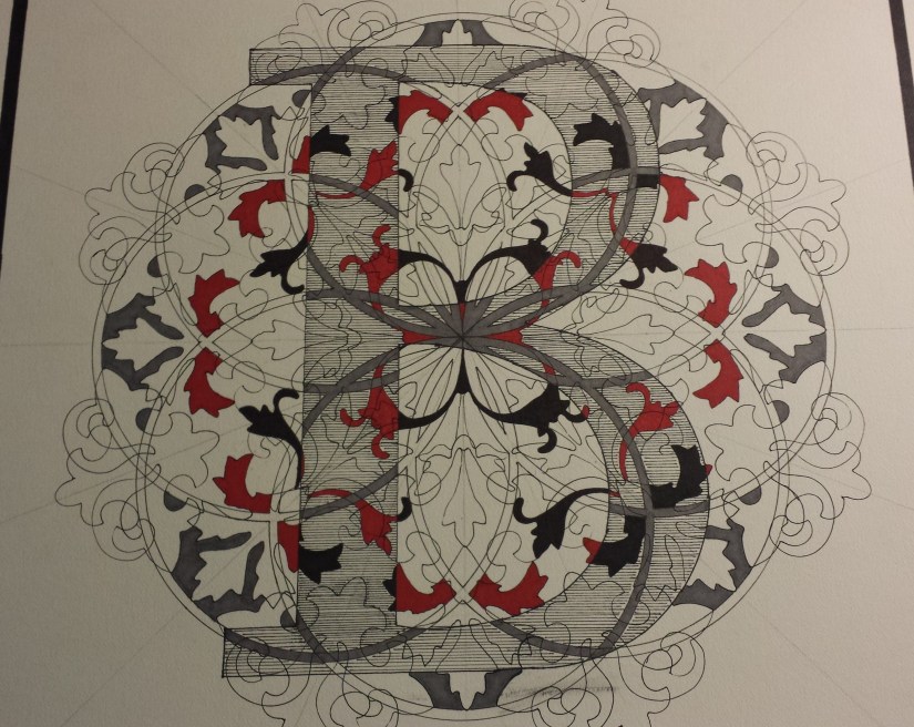
I started with the letter B, and followed the initial “Rules” as best as possible… but then I noticed that the “Rule” made the overall picture look too “busy” and this version was abandoned:
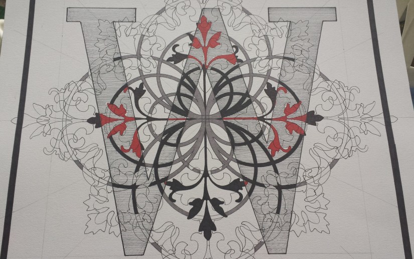
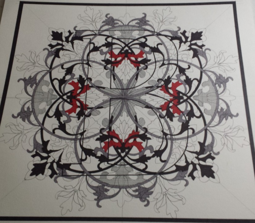
At the beginning of August I moved on to the W and felt that this time I had a better idea of what to expect, so I continued on with the original “Rules” and, again, found myself in the same predicament… and so W was abandoned, although, I will admit to feeling as though this version had more potential than the original B:
 version 1
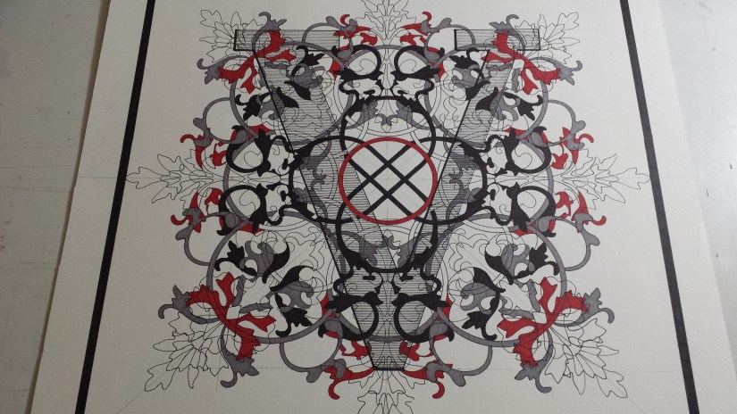
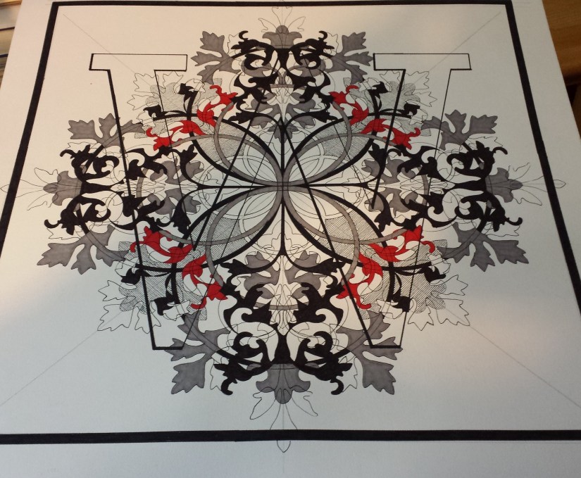
I then moved on to V, and, for a minute, I had thought that things were working out better… and then things got a little out of hand with the red Sharpie… I really liked the way the overall design came out, so I am going to recreate it as good as possible when this is redone according to the updated “Rules” of the Series… only with a LOT less red:
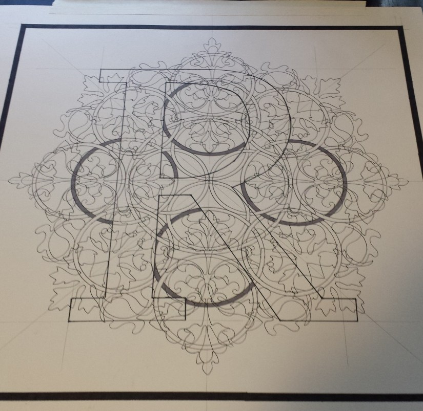
After the first three unsuccessful pictures, I focused on designing additional letters for the Series and moved on to R, which hung on my studio wall for a couple of months until I started figuring out how to proceed with the series. That is when the gray circles were filled in:
In October I made another attempt to “correct” what wasn’t working and started over with the W and instead of doing the opposite of what was in the letter, I simply let the design lead me. Unfortunately, as much as I was enjoying the overall design, I started to notice that I was losing the letter and it was getting difficult to determine that it was there at all:
 version 2
In early November, I tried another B… but didn’t spent as much time on it as I discovered that I was experiencing the same issue I was having with the revised W: I was losing the letter:
At the end of November, I decided to focus on the design of the Series and worked on A, as well as, the third W & B (see below):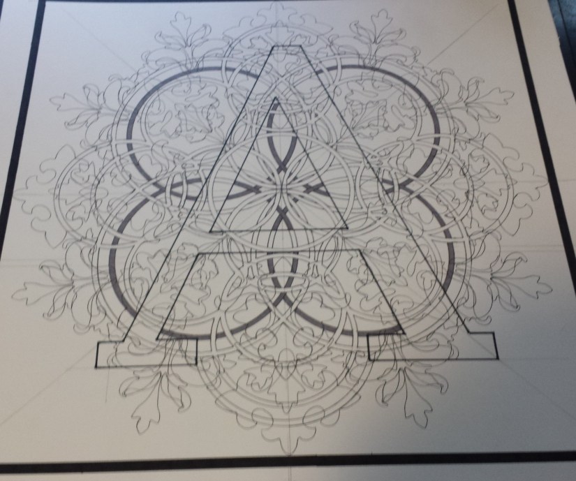
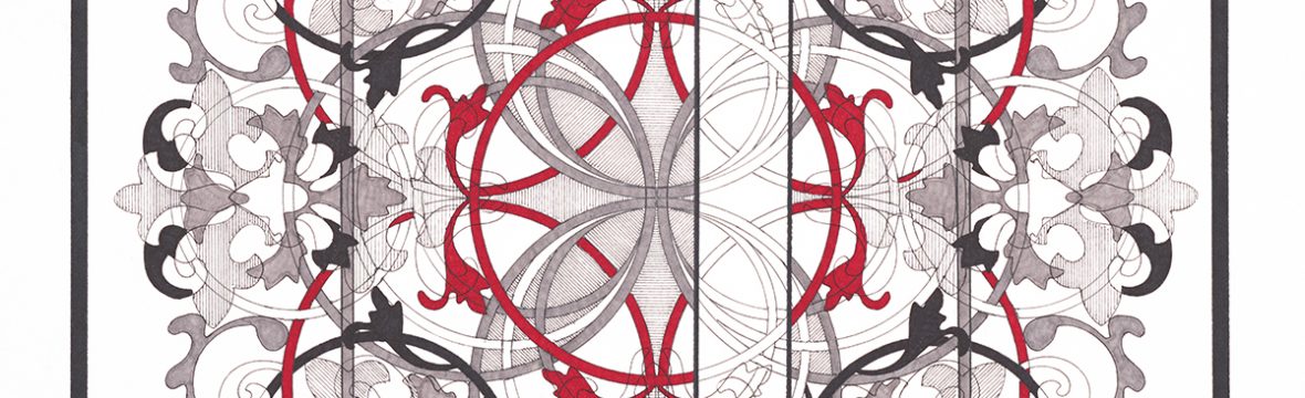
For this round of experimentation, the idea is to complete the overall design, but this time, I would block in the design OUTSIDE of the letter and just allow the outline of the design to show within the letter: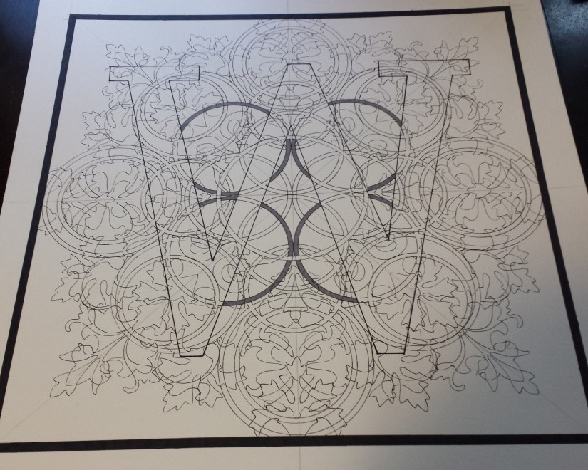
I have just started working on this idea on the 3rd B and am hoping that it will allow the letter to remain visible without destroying the overall design: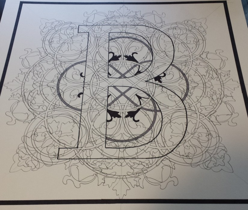
It is too early to tell if this will be the solution to the issues I have been experiencing, but I feel that this has been the most productive couple of weeks that I have had in a long time and I am just happy to be spending more time in the studio and am looking forward to the first “completed” picture in the Pismo Series!
White Rooster Studio
Copyright @2018 White Rooster Studios. All Rights Reserved.
