Some days, while working in the studio, it can seem as if you can do no wrong. Every mark you make, every decision just “works”…. and then there are others, where things seem to just take a wrong turn.
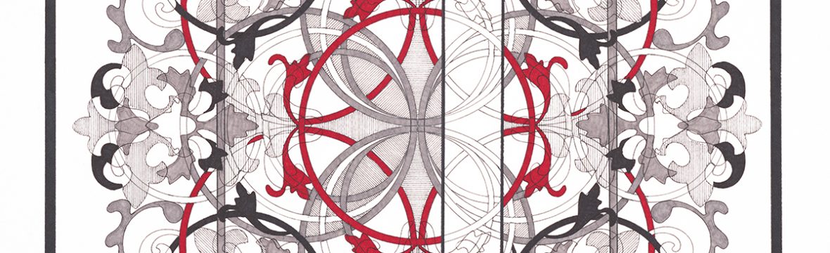
The original “Autonomy” was started in October of 2017 and had what I had thought was a great start…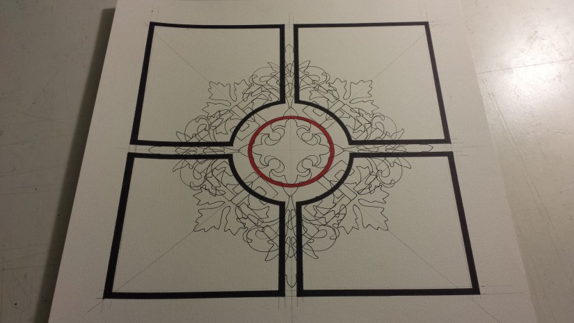 … and then, just as quickly as it all started, things started to go “wrong”:
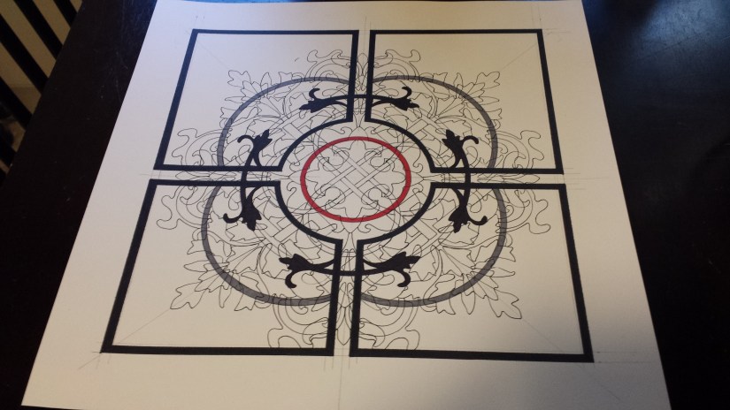
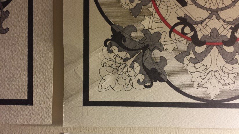
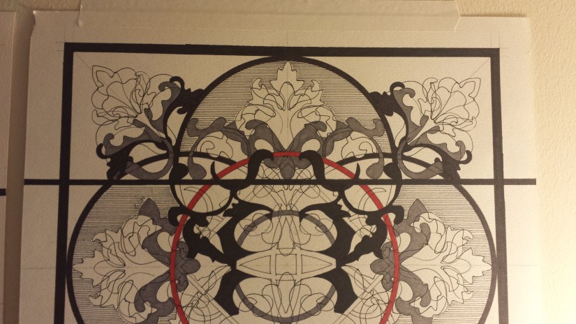
And just like that, I was stumped… and this picture ended up hanging on my studio wall so I could look at it and try to figure out a solution to the “problem”. I liked the look of the picture divided into four panels with the curved interior, but I wasn’t thrilled with the areas that had been filled in and after it hung on the studio wall for a couple of weeks, I simply could not see the solution. I have not given up on the design and have every intention on completing the picture, but for now, I have shelved the picture and have decided to try another approach.
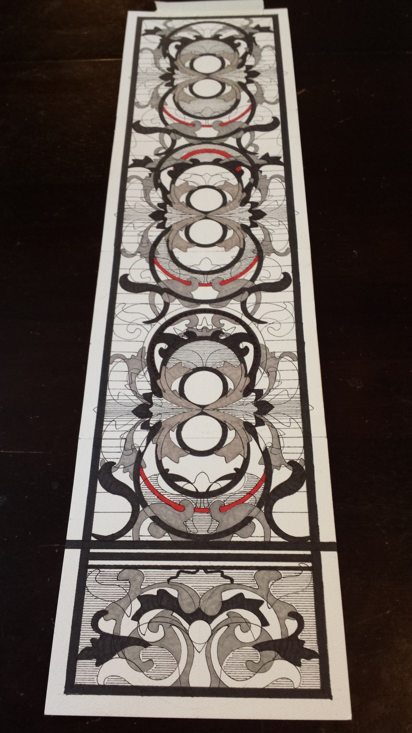
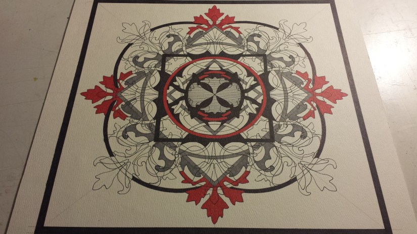
I began the new “Autonomy” a week ago and, so far, I am liking the direction that it is taking: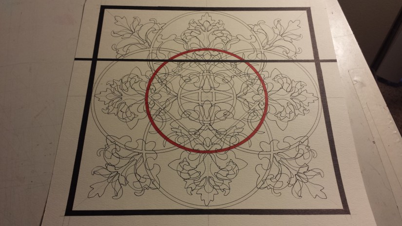
The panel idea has been shelved temporarily, and replaced with what I am referring to as the “iceberg effect”. A couple of months ago, I was walking by a bank of old filing cabinets at work and on one of the sides of the filing cabinet was a picture of an iceberg showing both what is visible above the water line and what is below, which is substantially more that what is actually visible. The idea that this could be translated into my work was intriguing… until it was pointed out that I have been doing this for some time now, still, at least it now has a name 🙂
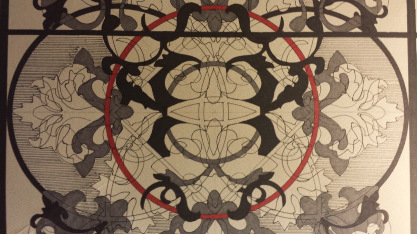
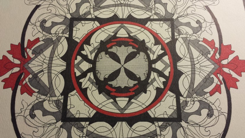
I have been adding a small amount of red to my pictures for a couple of months now and am toying with adding even more to this one.
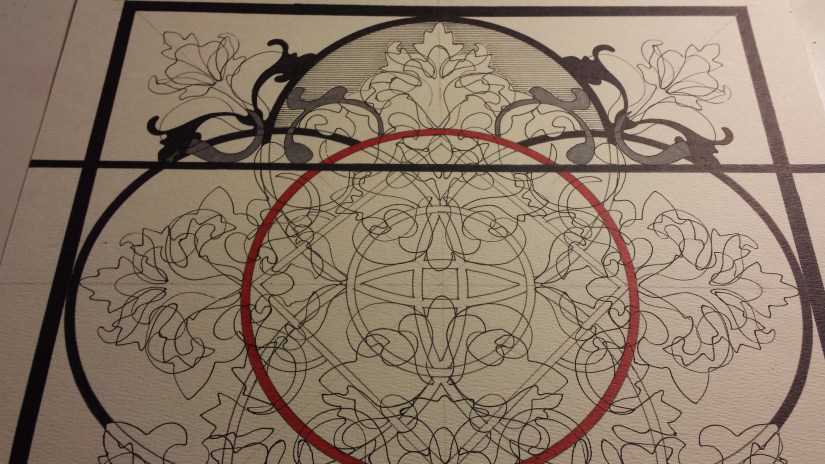
For some time now, I have not been happy in how I have been treating the “center” of my pictures, and have allowed the internal sections of the Celtic knot to dictate how it is treated. However, for “Autonomy” I thought that I would be able to “break” that habit and chose to ignore the internal knot and tried to continue the design within the red circle. So far, things seem to be working and I am hoping for a final solution to the final design to “appear” after studying it for a few days: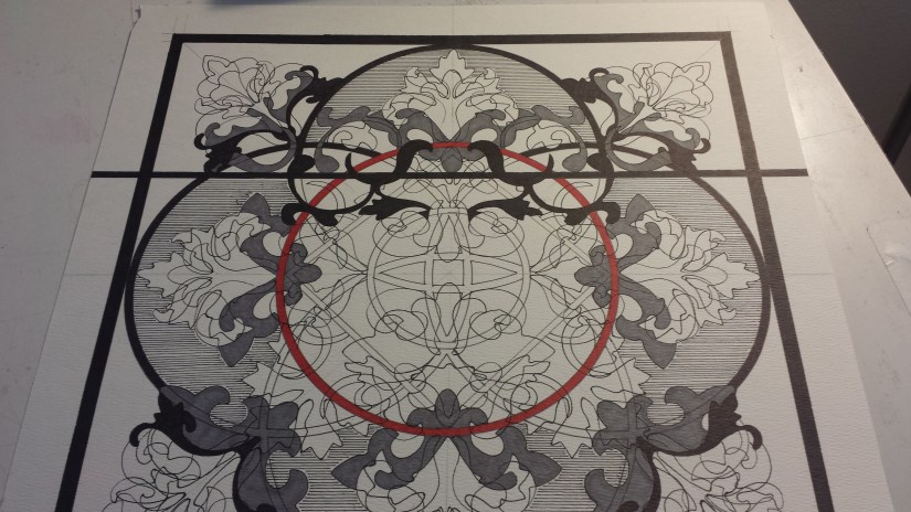
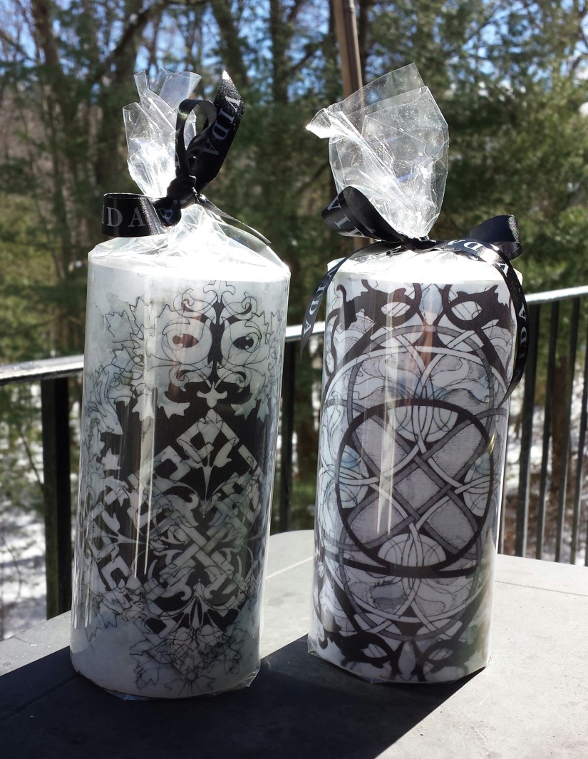
White Rooster Studio
Copyright @2018 White Rooster Studios. All Rights Reserved.