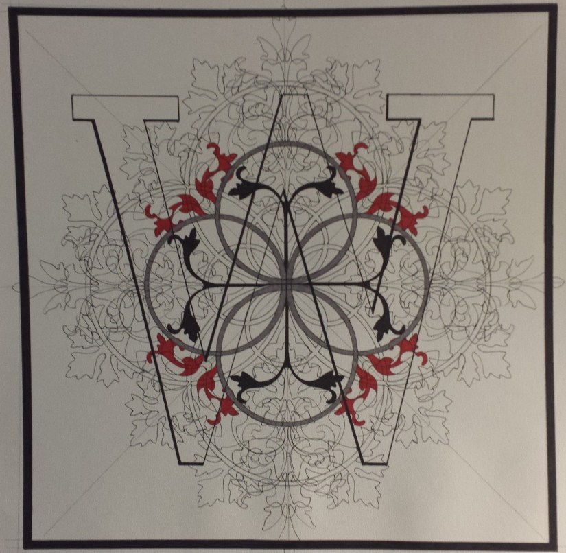
From the Studio: Update on “Pismo 2 (B)” and “Pismo 23 (W)”

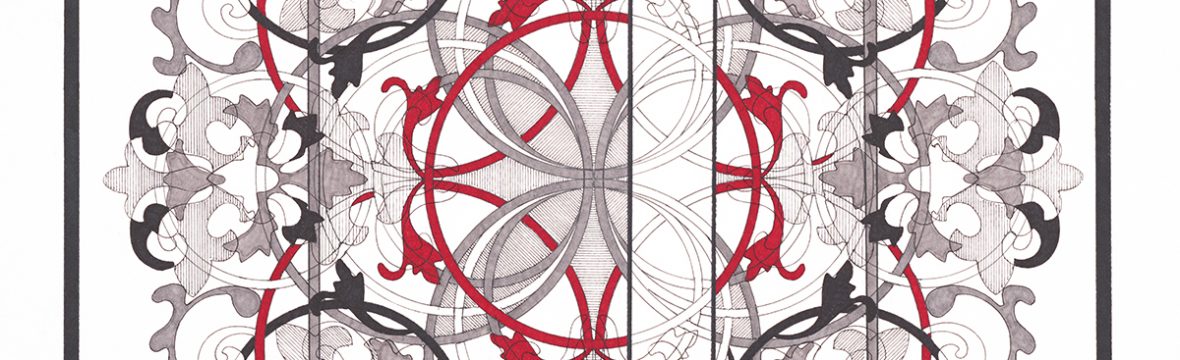
I believe that I have gone about as far as I can go with “Pismo 23 (W)” without overworking the picture:20181028_145719crop

This issue now is: the W is kind of hard to see now. I love the design, but I need to figure out what to do about making the W more prominent. I have thought of added a light wash of Chinese white watercolor paint over the letter as well as adding some kind of shadow under the letter… just not sure if that would ruin the picture yet.

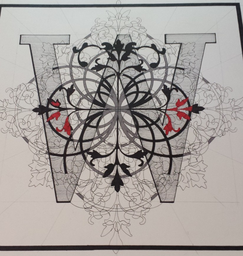
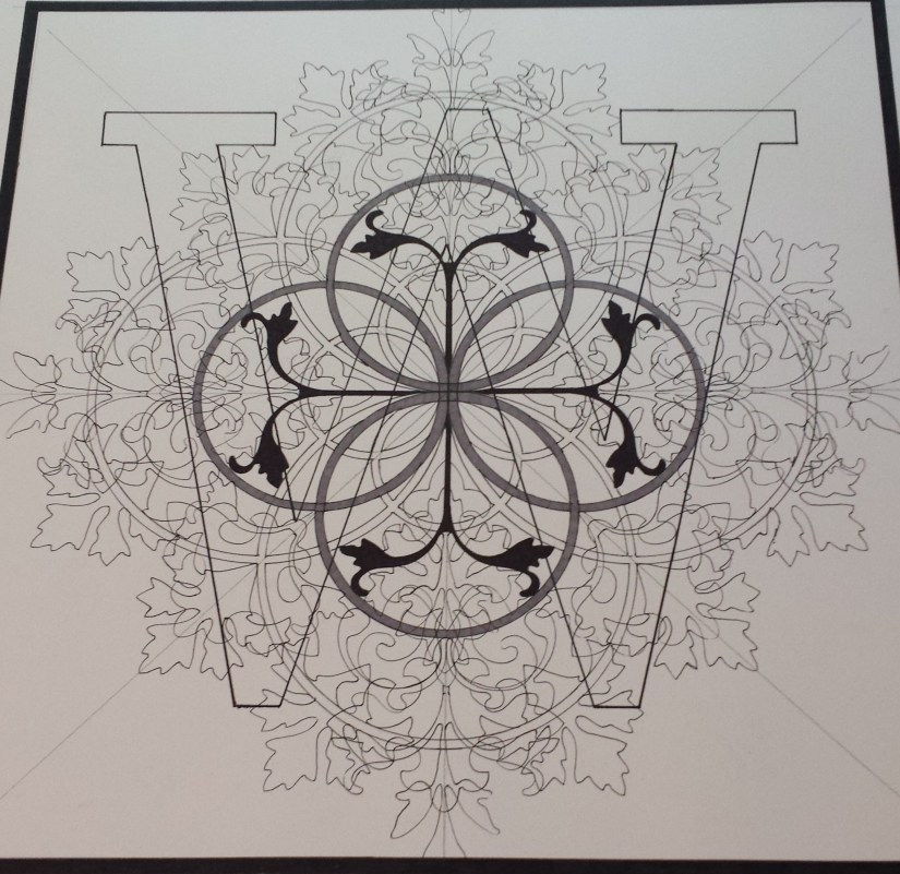
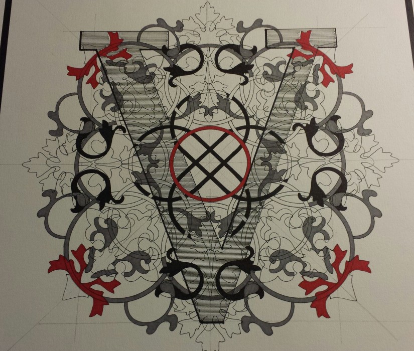
I have “Pismo 22 (V)” that needs to be re-worked, so I am going to test this idea on that picture before I move forward with the W.

I have considered going back to my original idea that whatever is within the letter should be the opposite without… I found a Celestial Grey Sharpie online and ordered a couple to see if that would work… 20181028_145902crop

The Slate Grey Sharpie that I have been using is on the top and the new Celestial Grey Sharpie is on the bottom. Based on the colored caps, one would think that this COULD work… Alas, I don’t think it will:20181028_145816crop

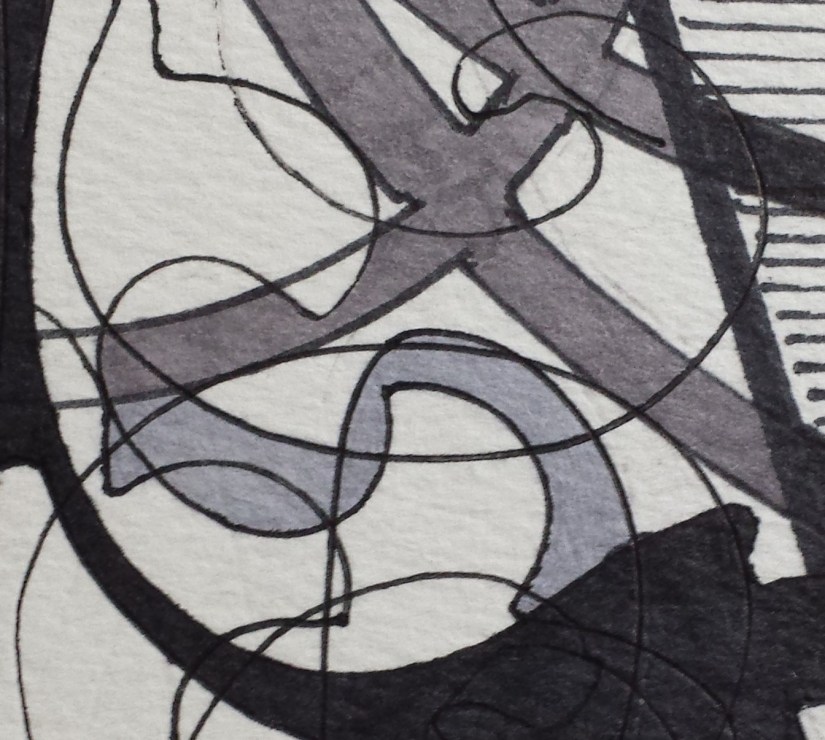
The Slate Grey DOES appear darker, but I don’t think that the Celestial Grey that I added as a test near the knot is light enough to use to resurrect my original idea. The Celestial grey is cooler, but I feel it still would be difficult to distinguish between the two greys when viewing the picture at a distance.

This all may be a blessing in disguise as I am pretty much convinced that I have purchased ALL of the remaining Celestial Grey Sharpies available on the Internet right now. My concern was: should this experiment work, would I be able to buy enough Celestial Grey Sharpies to complete this project??

So… will be doing tests this week with the Chinese white watercolor wash and will cross  my fingers that I will have more success with making the letter stand out more.

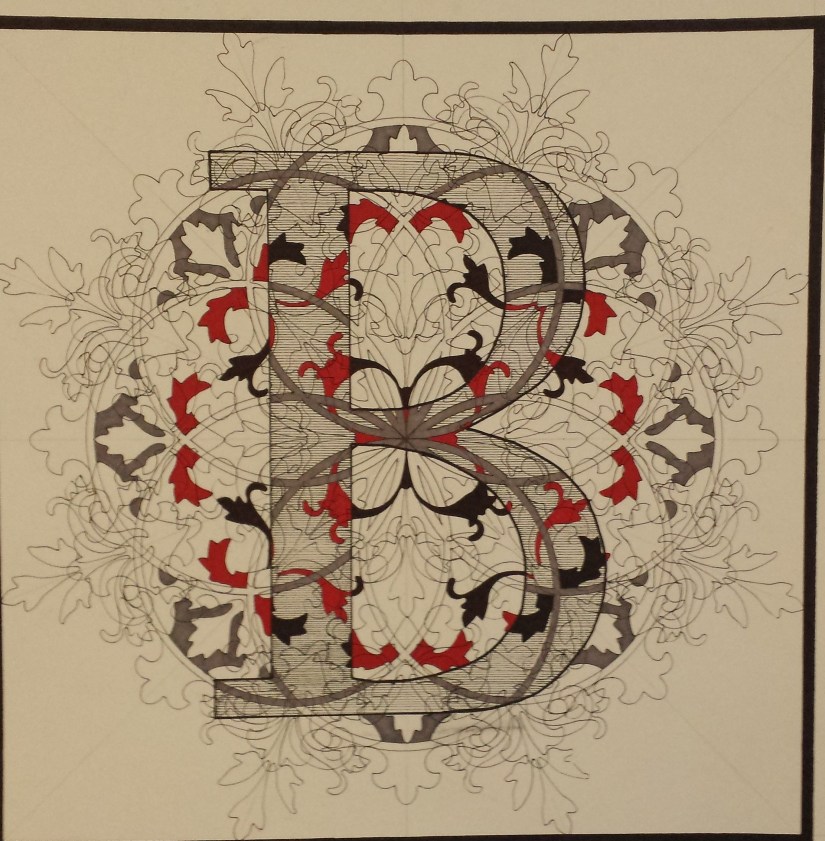
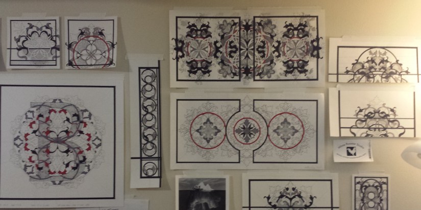
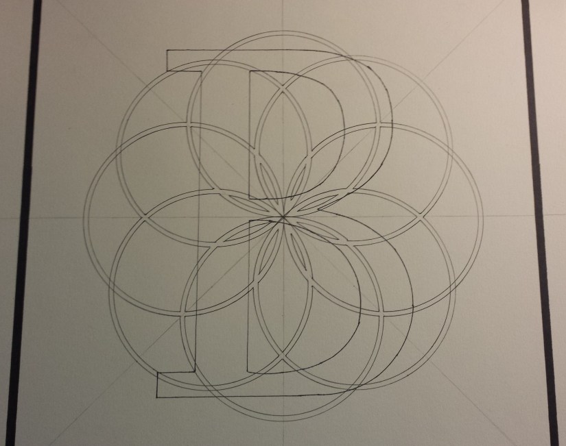
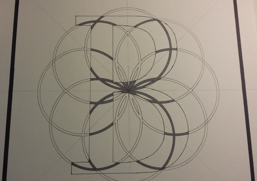
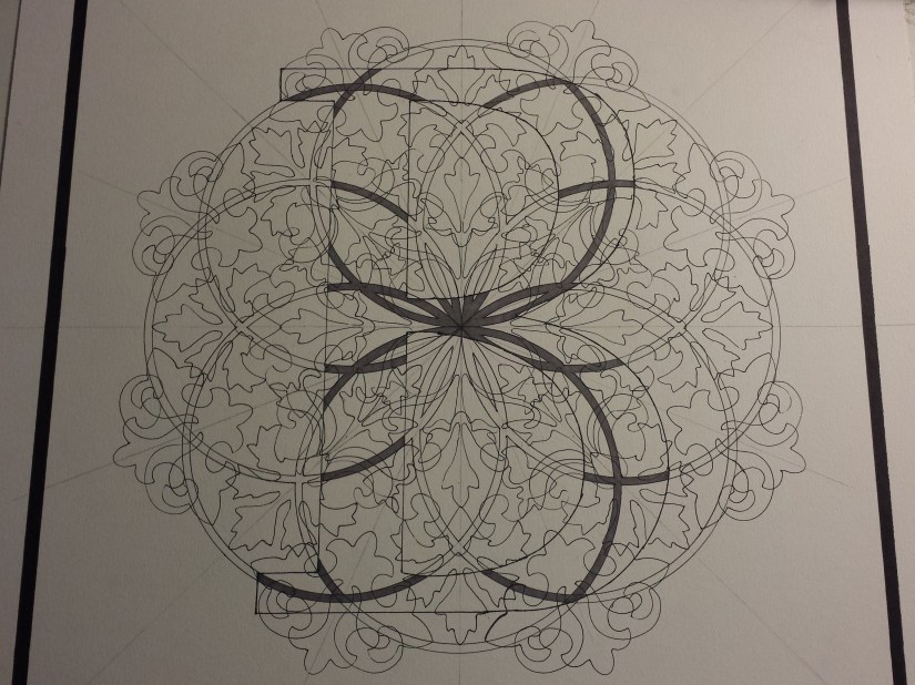
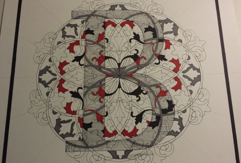
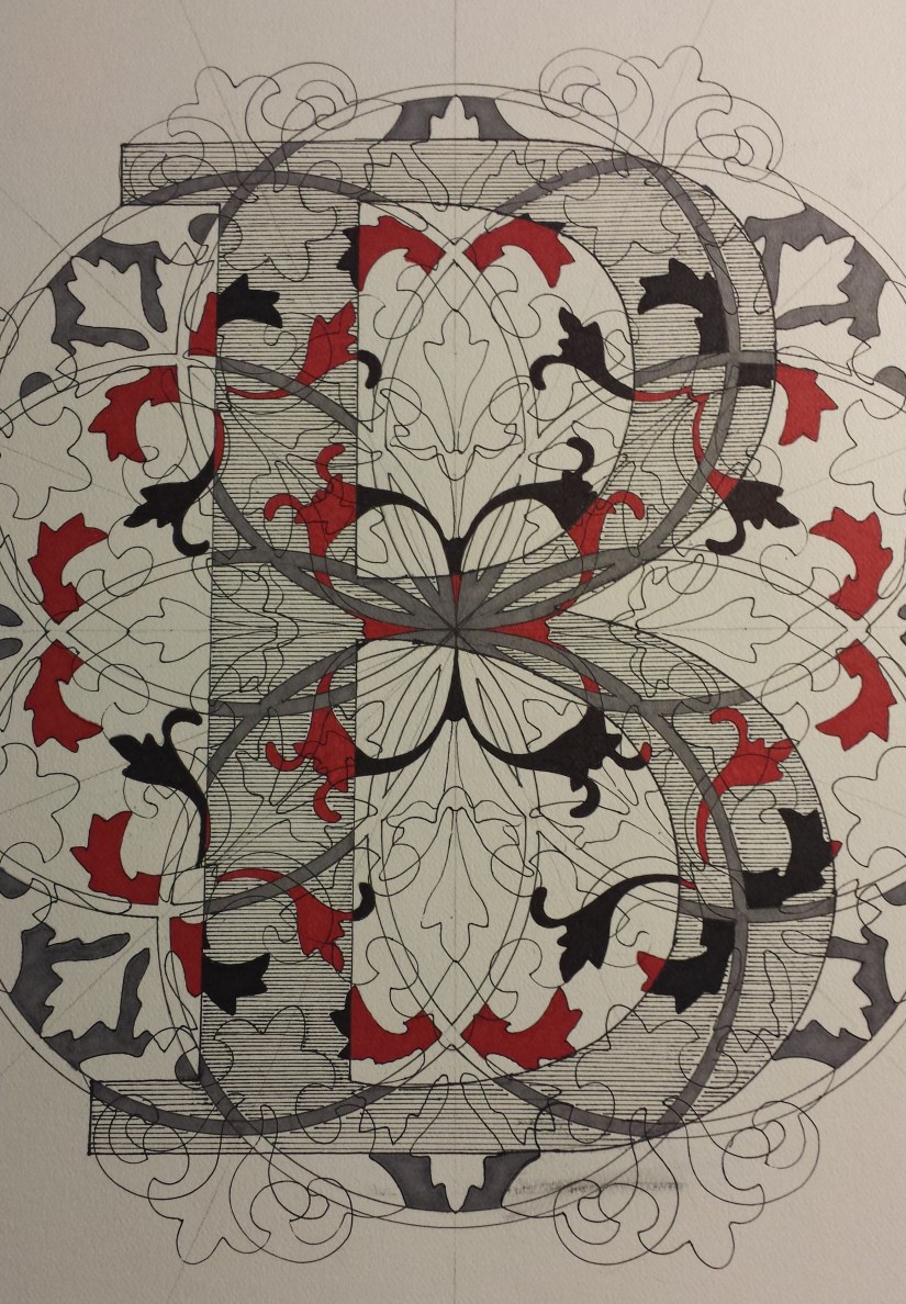
I have begun a 2nd version of “Pismo 2 (B)”… and I am not sure I like the direction that it is going in yet:20181028_145700crop

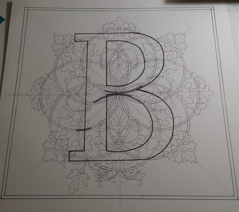
Obviously, the overall design has not been completed, so perhaps it is too soon to worry about the finished product. I think I am just going to stop worrying about the project in general and just let go and let the design evolve naturally and see where it takes me.

White Rooster Studio

Copyright @2018 White Rooster Studios. All Rights Reserved.


From the Studio: Update “Pismo 22 (V)”

I have a suspicion that “Pismo 22 (V)” may be overworked, so I have decided to step away for a week (or two) and see if the design still “works”:20180923_150943

I was able to spend some time in the studio Friday morning and yesterday afternoon… and, at some point, I know that I should have put the red Sharpie down… but when I get into a picture, I find myself facing compulsions when it comes to shapes. And, in this case… I ‘saw’ these shapes, but now I am concerned that the design may be compromised.

On the other hand, I am waiting for an order of masking fluid to arrive this week so I can move on to Phase 2 of this picture and use a more controlled ink wash than I usually add to my pictures. Who knows? Perhaps this will “tone” things down a bit and allow the “V” to “pop” out more because right now, I feel as if it is being overpowered by the overall design.

I know that this project is technically still in the development phase, so I am OK with the idea evolving and new ideas being worked into the project. I am already on the 2nd round of “B” and “W” (see below) and if I have to move on to round 2 of “V”, I am OK with that also… On the positive side: IF I do need to create a 2nd “V”, I can use the one I have as a testing ground for the masking fluid idea, so not all is lost.

20180916_130302

The big takeaway from this is: I am creating and playing with new ideas and if this beginning stage takes longer to work out the kinks, well, so be it. I am excited about this project and I am planning on spending more in the studio going forward… and, that’s all that really matters right now anyway.

Please feel free of post comments, what you feel is working, what isn’t. Art is a collaborative process and I am open to new ideas.

White Rooster Studio

Copyright @2018 White Rooster Studios. All Rights Reserved.

From the Studio: Update on Pismo Series

Sometimes, your ideas work… and, sometimes, they need a bit more tweaking.

When I conceived the Pismo Series, I had an idea for a Rule that I thought could push my work into an intriguing new direction:

  • Rule: Whatever is “inside” of the letter, the opposite is to be done on the “outside”.

And while I feel like this a great idea… I feel at this time it needs more study.

I found that once I completed the initial blocking in of the letters “W” & “B”, that I was at an impasse and ended up staring at the pictures taped to my studio wall for weeks with no clear solution or direction in sight.20180826_124521

So I made the decision to do the “W” & “B” over again, see the new “W” below:20180826_124512

I found that once I got the to third picture in the series, “V”, that the initial design seemed to work better by NOT applying the Rule:20180818_162005-1 - Copy

I have decided to use the original “B” for testing, not only to work out the Rule, but to see if I can utilize a more controlled ink wash with masking fluid and rubber cement. I have experimented a little with both in the past and would like to see how far each can be pushed and how they could be used to enhance my work:20180826_124416

Design for “R”:20180826_124429

Some of the initial designs for the Pismo Series on the studio wall:20180826_124356

Last weekend was a huge prep weekend: the remaining paper that I had on hand has all been cut down to 20×20 inches from 22×30 inch sheets. All now have a border and I have started to add the letters: a new “B”, “T” and an “A”. Enough paper has been ordered to complete the series and is expected to arrive this week.

I have a number of projects in various stages of completion (several I feel need to be revisited and reworked), but I am finding that I have been consumed by this idea and have spent more time on Pismo over the past couple of weeks – and I can’t be more happy about this.

White Rooster Studio

Copyright @2018 White Rooster Studios. All Rights Reserved.


From the Studio: Project updates

It has been a while since I have posted studio wall pictures highlighting projects in progress and, after looking at the studio wall this week, I realized that I have more projects in various stages of completion that I had originally thought.20180714_140902

For at least two of them, like the Journal Project (size 8×8 inches square) and the Virtues Project (8.5×14 inches), I cannot say for sure at this point if I will be revisiting them at all. Both projects were experimental and were focused on working on a smaller scale, but I found that I was having too many issues forcing myself to work within the size parameters I established.

I am not sure if it was the result of working on the I Ching project for several years (the final size of the pictures for that series was 15×22), but I have since learned that I feel more comfortable working on a larger scale and I have decided to allow my work to evolve more in that direction.

I had begun my second picture in my revised Baugua series, Xun (Wind), before our vacation last month and while we were away I ended up completely redesigning the picture. I now have the base and the organic forms completed and have begun blocking in the picture. I have added this picture to my wall so I can try to observe new patterns and forms. I find that when I cannot see a clear pattern that taping the picture to my wall for a couple of days (or weeks) will usually yield a solution:20180714_140630

I am also experimenting with another unnamed picture (I am not sure yet if I want to expand this into either a new series or jumpstart one of the projects that has stalled), the size is 10×20 and, for the first time, I used a pencil instead in ink for the design so far. The hope was to allow me to push the designs into new forms and a more challenging direction, but it is too early to tell yet:20180714_141334

I am not sure if I have mentioned this before, but this blog is a new site as of February of this year, allowing for more versatility and links all of my other sites in one place. If you are interested in checking out my original blog on Blogger, please go to: http://whiteroosterstudio.blogspot.com

White Rooster Studio

Copyright @2018 White Rooster Studios. All Rights Reserved.


From the Studio: New series: Pismo

A couple of days ago I woke up with an image in my head, what I thought could be the start of (yes, yet another) new series. I saw a capital letter added to my knots and organic shapes and with some tweaking, I believe I have come up with something fun:

  • Scope of project: 26 pictures
  • Size of picture: 20 x 20 inches
  • Font: Lucida Sans
  • Size of letter: 12 inches
  • Rule: Whatever is “inside” of the letter, the opposite is to be done on the “outside”

Template:20180707_160245

Beginning of experiment:20180707_163222

Organic design completed:20180708_131236

Initial stage completed, letter “B” has been shaded and the main portion of the blocking in of shapes where they come in contact with the “B” has been filled in:20180708_160522

Close up of the “B”, the ink smudge on the bottom portion of the picture was the result of ink build-up on my rolling ruler. Seeing that the final step will be adding the ink layers, I am hopeful that the smudge will not be as noticeable once the picture has been completed (cross fingers):20180708_160547

I decided to call this series Pismo because the Letter Project or the Monogram Series just sounded boring and my partner came up with the brilliant suggestion to check out what the word “letter” was in other languages (THANK YOU!!!). Most of the suggestions were just as boring as “letter” or “monogram”, but Pismo came up a couple of times, so I chose the Croatian word for “letter”.

I should also mention that this amused me seeing we had just watched the FIFA World Cup match between Croatia and Russia in which Croatia won after extra time and penalty kicks. So, go Croatia! Good luck on Wednesday!

White Rooster Studio

Copyright @2018 White Rooster Studios. All Rights Reserved.